

Google has always been a little behind in design for mobile Operating Systems. Since the iPhone, Apple has been clearly has pushed for visual appeal. While Android has aimed for functionality both have found success in these fields. But has Google gotten a little too behind? The relative desirability of Apple phones seems to suggest so. Even Microsoft have had success with flat design. However with Android L Google looks like they are finally recognising the importance of an attractive, responsive interface. Having finally introduced a vast overhaul with Material Design to huge acclaim.
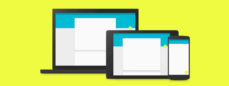
So how has material design made such an impact? Android L has removed unnecessary design elements making a new truly responsive design. The result is both stunning and practical, all whilst having a very unique look. So how did they do it? Duarte (Android’s VP of design) says that Google are finally looking at the bigger picture. Before Google’s several design teams were very disjointed. Teams would work on a single resolution solving their own issues, unaware of the repercussions. Effectively, creating a very inconsistent design across various devices. Now, the design teams are unified working together with a single aim. To create a simple, functional UI which is just as fantastic to behold as it is to use.
Material Design Guidelines
Google have made their new design’s intentions public. Their aim is to incorporate both classic design principles while using new technologies to innovate. To Develop a unified experience which is powerful across all devices regardless of input method or resolution.
Their basis of material design’s principles has been heavily inspired from print-based design. Google says “The material is grounded in tactile reality, inspired by the study of paper and ink, yet technologically advanced and open to imagination and magic”.
Universal Language
By using layers and lighting material design creates a sense of depth. Google says that this is intentional, not only does it look pretty these elements anchor hierarchy, meaning and focus universally. This can be enforced further through the use of colour and typography if needed.

However Google have gone one step further with Material design. Not only are they looking to physical world rules to create understanding of functionality. Android L looks to visualise actions made through motion. Motion provides subtle but clear feedback when a user initiates action. Even if for the purpose of an application a design completely changes, material design will use motion to keep continuity fluid. Read in full here.
Industry Impact
We think this redesign is a huge step in the right direction and expect to see it have a massive impact in the industry. Much like Microsoft have done with flat design. Google are clearly aiming for this with their incredibly detailed guidelines and web development kit (they are practically telling you how to replicate their design).
Give us as call on 01273 328877 for your free website consultation.