

Found yourself struggling to choose what colour scheme you want to use on your website? In design the choice of colour is paramount as your audience will immediately connect and feel certain emotions upon seeing your colour scheme.
For example blue will indicate calm tones linking to maturity, professionalism and intelligence. Cultural backgrounds may change people’s initial impression but all the same everyone will immediately feel certain emotions upon seeing chosen colours.
When you mix various colours into your palette the result can be somewhat difficult to predict. So how do you go about choosing from your palette? Well, many designers will use either a colour wheel or they will use software to test different colour schemes.
However there is an alternative, monochromatic design. Monochromatic design is a website using a single primary colour with darker and lighter shades to produce a safe and unified experience for your visitors.
Advantages of Monochromatic Design
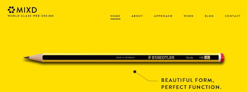
Monochromatic design is a simple solution because it is simply easier to implement. The most obvious advantage to monochromatic design is that your colours cannot clash as you are only using one. Celebrating minimalist design. In a world where colour is blatantly used to grab your attention subtle elegance suddenly becomes very noticeable. So noticeable in fact that it can be hard to forget, when you use a single colour to personify your brand for a long period of time we will associate even the colour with their produce, think about what Coca Cola & Virgin have managed to achieve with the consistent use of red.
Another benefit to monochromatic design is when used efficiently the lack of distractions will pull your visitors straight to the punch. Your audience is forced to focus on your content this is most beneficial on portfolios or product pages.
Disadvantages of Monochromatic Design
The use of one colour is an art. The lack of variation when incorrectly implemented can make a website look quite bland and empty. Another issue you may find is that monochromatic design can prove difficult to produce organic visual cues.
However you can avoid this by highlighting your focal points by applying colour which stands out against your primary colour. This will simultaneously both grab attention quickly while remaining elegant.
I hope that this has helped clarify Monochromatic design for you. If you would like to learn more about how we can help your business with web design please leave a comment below or call us on 01273 328877.