

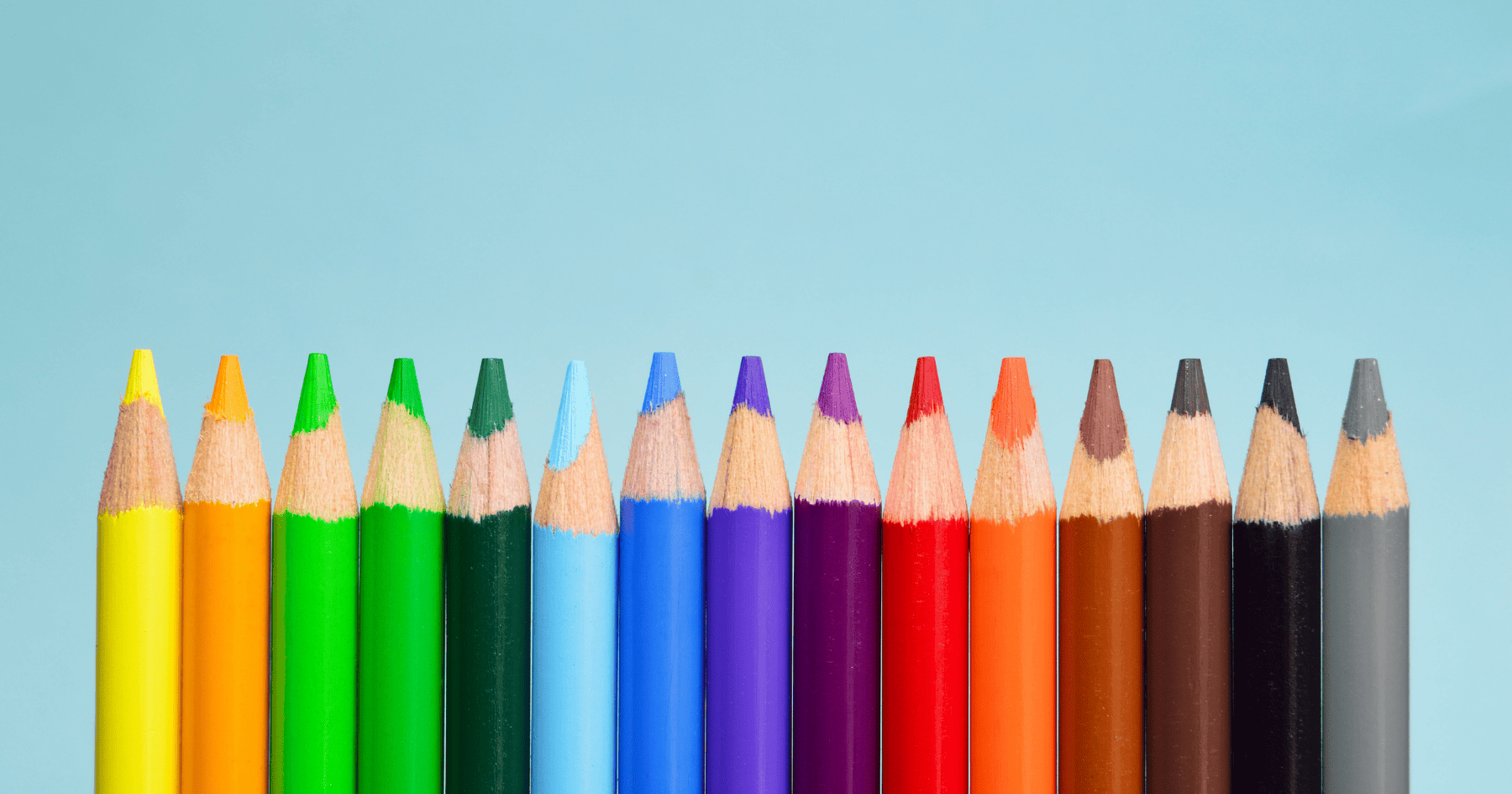
The colour you choose for your logo design not only has an aesthetic impact, but also a huge impact on consumers’ emotions and purchasing behaviours. The right colour can highlight your company’s strengths and attract your target customers, whilst the wrong colour can discourage customers by being misaligned with your brand personality. Before picking a colour for your logo design, it is crucial to think about what traits you want this colour to highlight as customers subconsciously choose brands that align with their personal identities. This is referred to as colour psychology, and is a powerful marketing tool as it considers how different colours impact consumers’ perceptions and trigger unique emotions. In order to best connect with your consumers on a psychological level, we have made a list of all the colours and what these might convey about your brand. Have a read down the rainbow and see what colour is best suited to your brand image.
RED
Research suggests that the colour red is one of the first colours humans can see as babies, and therefore we can see red vividly throughout our lives. Indeed, when people stare at red for long periods of time it actually increases their heart rate as it is the most stimulating colour. This has led the colour to be linked to strong emotions such as passion, anger, and excitement. Red also has a strong evolutionary meaning as it was the colour humans could easily spot on trees to harvest fruit. Red is a great colour choice if you want to make a statement with your brand, but it is not recommended for maturer or serious brands. Moreover, red has been proven to stimulate hunger and so is commonly seen in food logo branding, such as KFC, Five Guys, and McDonalds.


ORANGE
Similar to its red counterpart, orange is great for a playful and energetic brand. The colour triggers feelings of youthfulness, but is not often associated with luxury or femininity. Much like the leaves in the autumnal months, orange is a colour aligned with change. If your brand is forward-thinking or cutting edge, then orange could be the perfect colour to convey this to consumers. Interestingly, orange can stimulate feelings of great taste and research suggests that hot chocolate subconsciously tastes nicer when drunk from an orange mug.


YELLOW
The lightest and brightest of all the colours, yellow has associations with sunshine and happiness. However, the colour yellow can trigger feelings of affordability which can be mistaken for cheapness. As yellow is one the of the first primary colours it has multiple associations throughout history such as corn, crops, and gold. With the colour yellow the hue can greatly change the meaning, lighter yellow can signify more playful and energetic, whilst darker shades hold more weight. The only concern with yellow is that it is also the sign of warning and caution as it is universally seen on traffic lights.


GREEN
This colour isn’t linked to many brand personality traits, but has strong cultural associations. Its strongest association is with growth and life, this could be traced back to the middle ages where many pregnant women wore green and were painted wearing the colour. It can reflect very eco-friendly values so if your company has a sustainable focus then green could perfectly reflect your brand personality. However, in the U.S it is associated with wealth as dollars are this colour so it can be an appropriate colour for banking or investment brands.


BLUE
Blue is one of the most used colours for logos so if you pick this to represent your brand then you need to be aware of the competition to stand out. Blue can reflect a calm, trustworthy brand but simultaneously can exude a cold, calculated impression. Be wary of this colour in the food service as it reportedly suppresses appetite. This colour exudes confidence, but if your brand is slightly more playful then lean towards a teal shade. Darker blue is better for maturer brands.


PURPLE
Historically, purple dye was very expensive to produce and so only the richest people could afford to wear it. Therefore, the colour came to be associated with luxury and wealth. This makes it suitable for older, more sophisticated brand logos. Purple is great for a project that is both playful and expensive as it signifies both traits simultaneously.


PINK
Pink has been equated with femininity in western cultures since 1940 when clothes became manufactured by gender. It is both soft and luxurious. Pink is palliative colour as it suppresses anger and anxiety, for this reason prisons and mental health institutions since the 1980’s have painted their walls pink to calm the prisoners.


BROWN
This is the least used logo colour of the standard pallet, so choosing brown can be very beneficial to stand out from competition. This colour represents masculinity and can be very compatible for outdoorsy brands because of its rich, natural colour. It represents aging, as it has been linked with rotting and decay, so this would be ideal for a vintage, second-hand brand.


BLACK
Black is a bold colour for a logo but can represent a slick, modern brand. Black is a very luxurious colour but also very elusive and simple. It represents power and authority but isn’t very playful, indeed during Medieval times devils were painted only in black adding to its sultry, forbidden qualities.


Hopefully this will help guide you towards a colour for your new business or your rebrand, or perhaps it’s helped you understand some of the less conscious impressions your customers might have about your current branding.
For more expert advice or branding support such as logo design from £99 up to full corporate identity projects and website development, don’t hesitate to reach out to TC Marketing.