We think a lot about logos, whether you’re aware of it or not. That’s why so much care and attention is given to them when branding your business.
They have to be simple, yet still convey the values of your business that resonates with customers. They have to be timeless, yet feel modern at the same time. It’s a lot to ask of a small piece of design, and any graphic designer will tell you it’s no easy task to get the right balance.
So where are we at right now with logo design? What are the key trends to make our businesses feel like they’re in 2021? Here are a few key points to help you on your way.
Minimalism
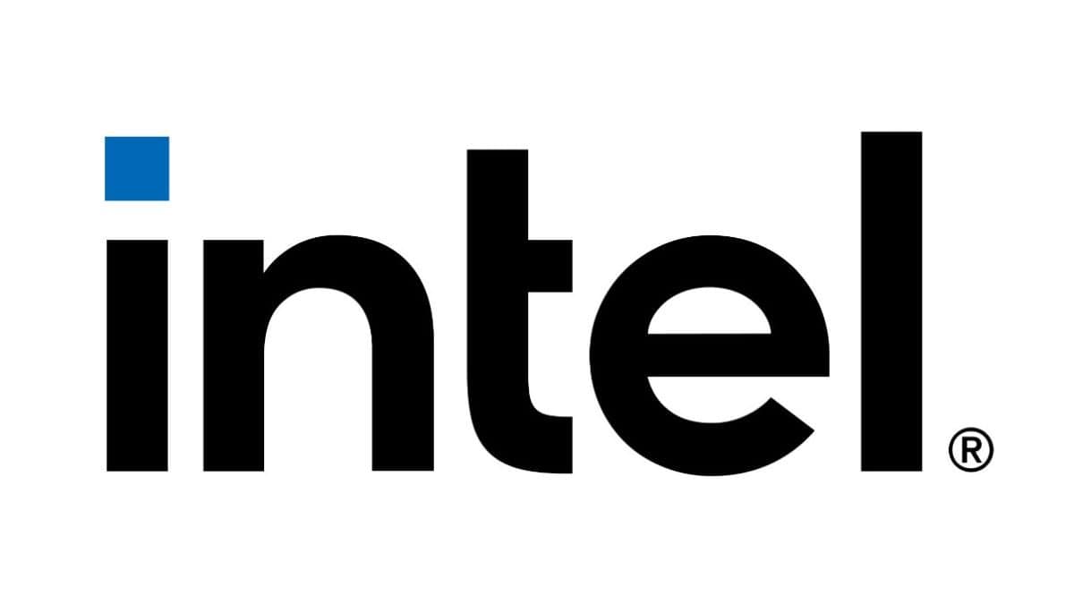
The minimalist train is steaming across the world and is showing no clear sign of slowing down. Companies are increasingly moving towards cleaner designs which aren’t cluttered. In other words, what large companies are trying to do is craft a simplistic art piece.
Check out some of these before & after logos.
Intel:
Simplex:
Hotel Ercilla:
Unusual Fonts
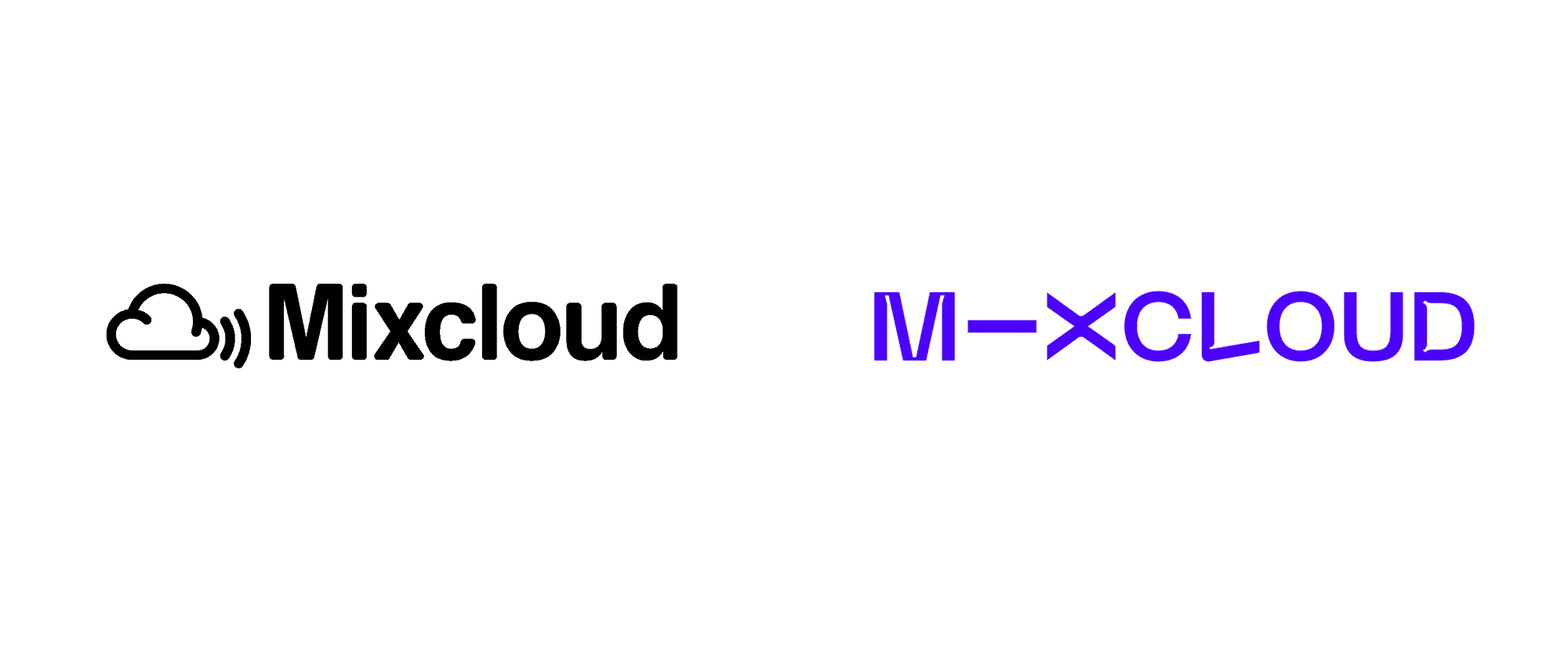
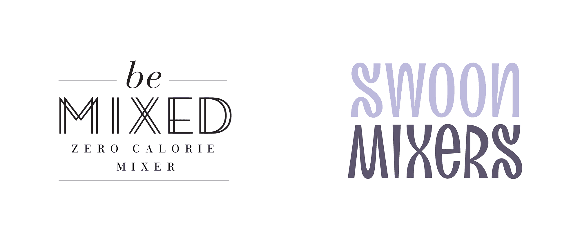
Intricate fontwork utilising serif, handwritten and fancy typography is a sure-fire way to create an eye catching logo. The tricky part is finding a balance between easy to read & uniqueness.
Mixcloud:
Swoon Mixers:
Gradients:
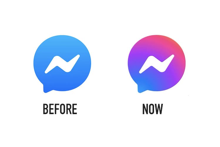
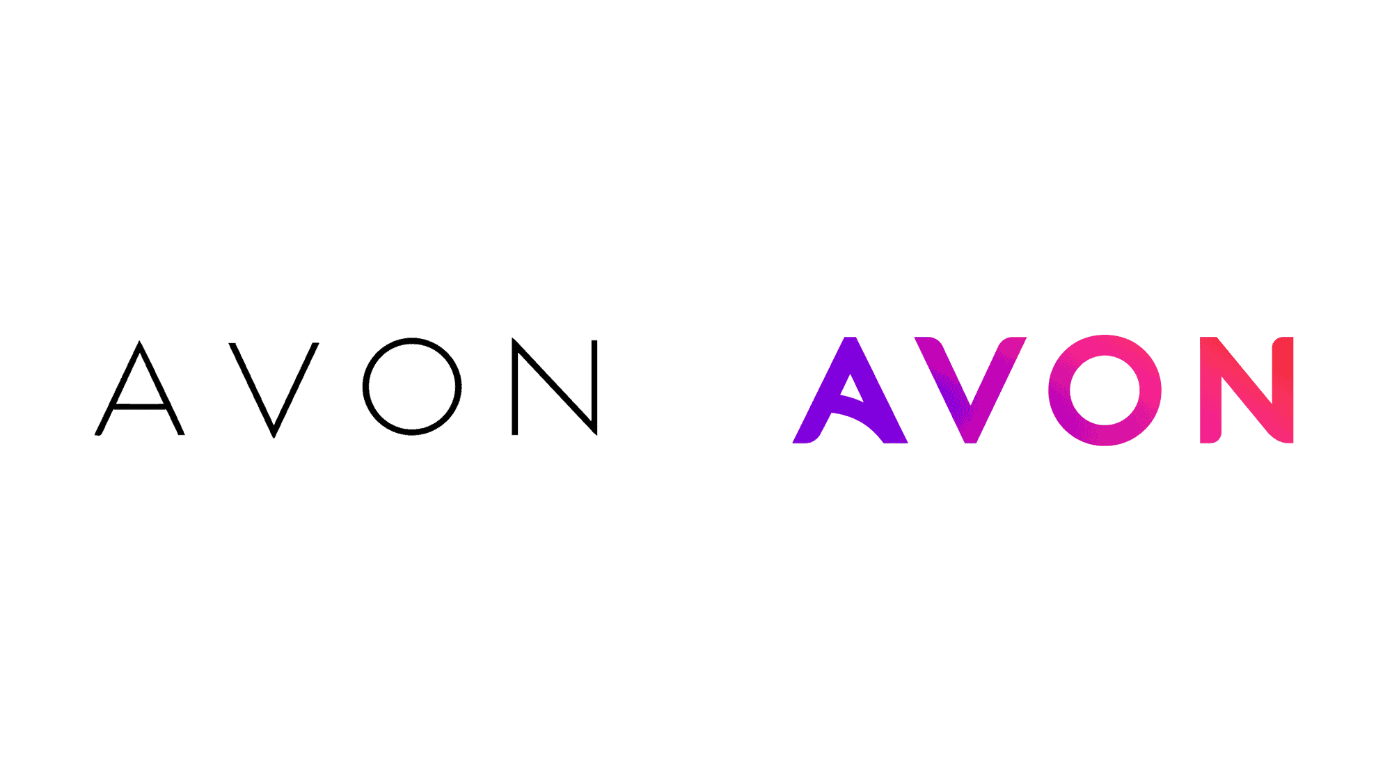
If you’ve looked at the icon for Facebook Messenger or Instagram recently, the most notable change visually is their clever use of gradients. Gradients are a simple way to spice up even the blandest logo. Neon shades happen to be ‘in vogue’ at the moment, but it’s definitely worth experimenting with different colours and seeing what happens.
Facebook Messenger:
Avon:
Text Destruction:
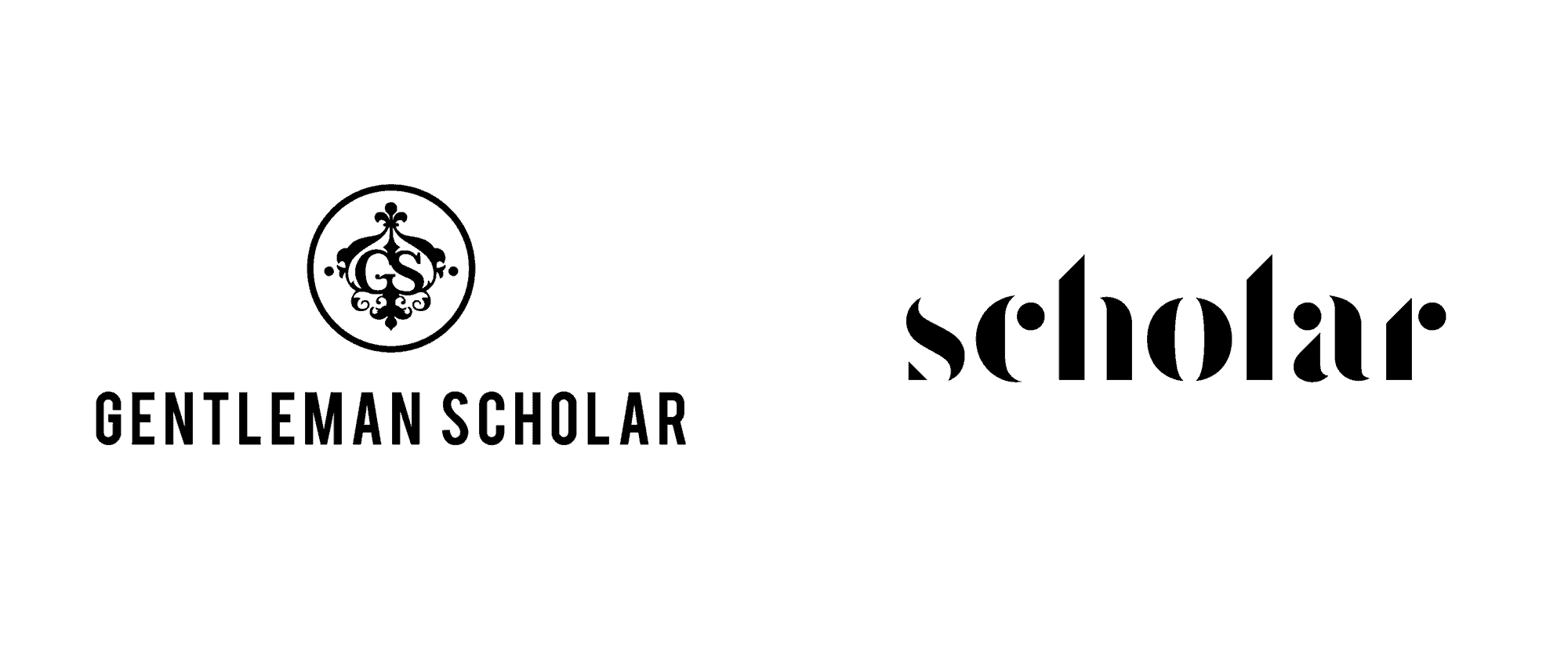
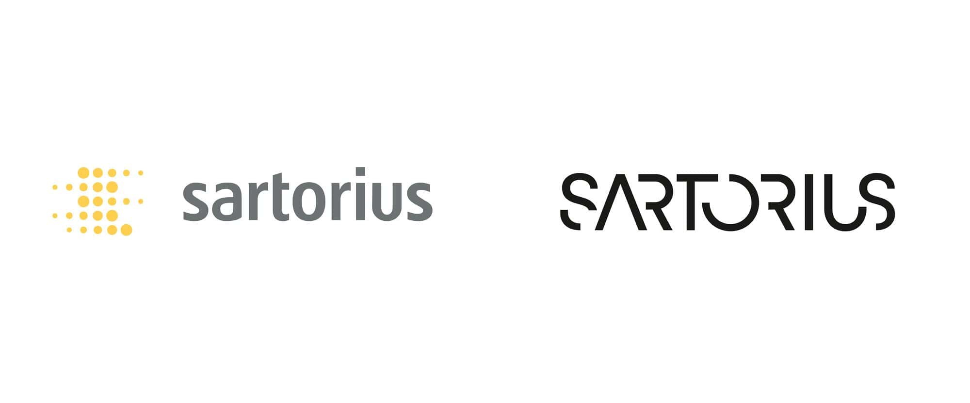
Removing certain parts of the word or image is a common technique when it comes to making your logo stand out from the crowd. It can make your logo feel unique even if you’re utilising a common font. Be careful not to go too far though as it’s important to make sure your logo’s message remains easy to perceive.
Scholar:
Blank Space:
Negative space is a clever way to add depth to your design without cluttering it with additional elements. This is a trend that we expect to grow stronger than ever in 2021.
World Snooker Tournaments:
Clean Thin Lines
Large, intricate designs are not to everyone’s taste. Instead, using a more refined technique can sometimes yield better results. Straightforward lines & geometry can make your logo seem more elegent.
Rolls Royce:
Visual Balance:
A visually balanced emblem is eye candy for those who can’t stand the sight of asymmetry. If you enjoy consistent and proportional layouts. Be sure to tap into this emerging trend.
Uniqlo:
Denver Art Museum:
If you’re thinking about redesigning your logo in 2021 or you have questions about branding your business. Why not get in touch with our team of experts and we’ll be happy to help you.


