

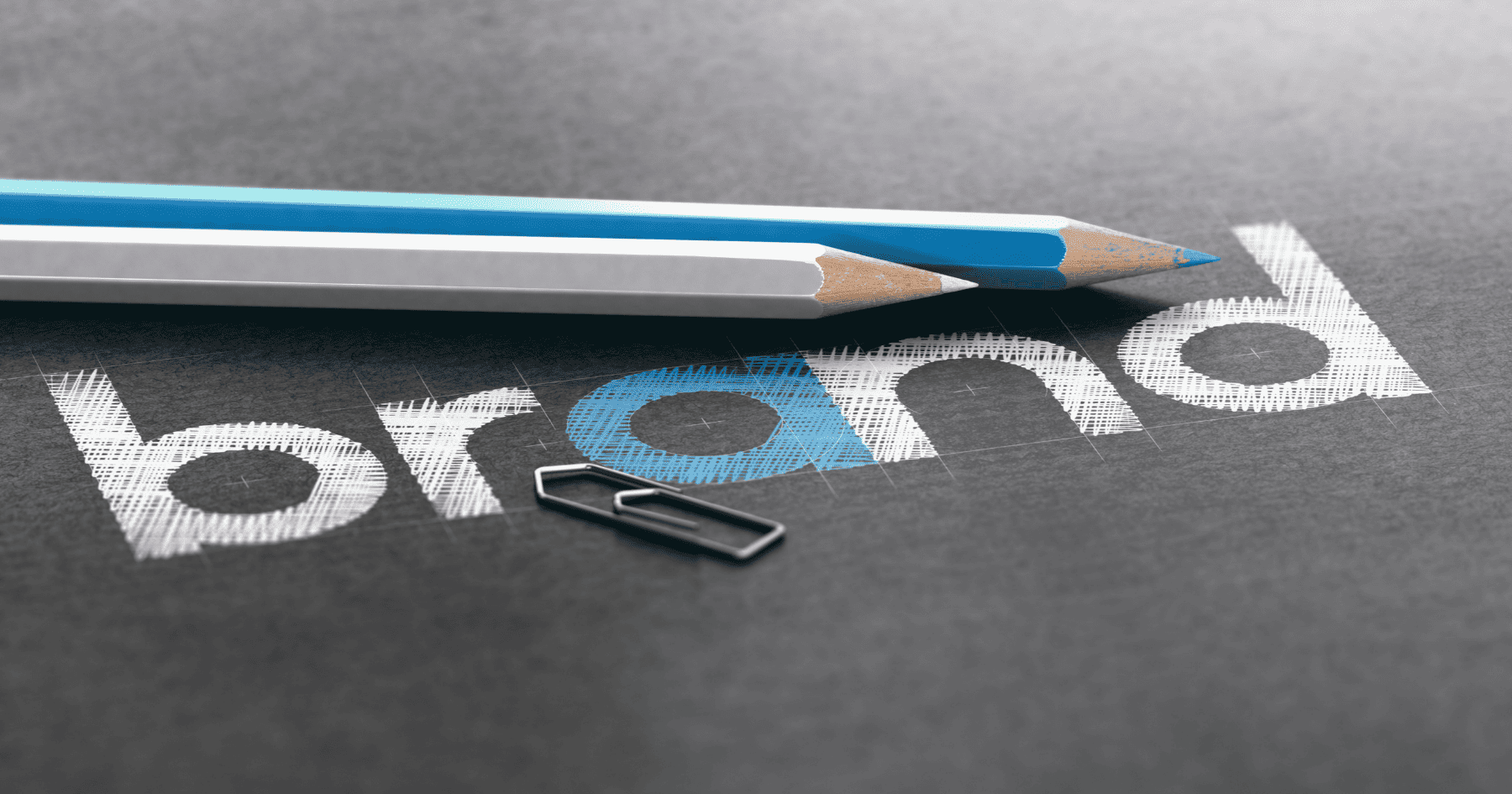
Logo design is one of the most important aspects of branding and can have a huge impact on your business, be it good or bad. A good logo design balances colour, imagery, and font design to convey your brand personality clearly to customers. A bad logo design can confuse your customers and muddy your brand’s message. Don’t panic though! We have compiled a list of the most common logo design errors, so you can learn from others’ costly mistakes!

Poor font choice
The choice of font is the backbone of your logo, so it is crucial to chose one with a coherent personality to your brand. If your brand is serious, go for a bold, classic typeface. If it is more fun, explore unique font styles. However, don’t go overboard with a calligraphy style font as it can cheapen the branding. Moreover, the font style cannot come before functionality. It must be easy to read and clearly convey the right message. Take some time researching different font personalities and try out various options before settling on the right one.

Too crowded
Da Vinci once said that “simplicity is the ultimate sophistication” and this could not be more true of logo design. You may have a lot to articulate to customers and be tempted to put this all on the logo. But too much complexity can be confusing to customers and undermine your message. Try to think of 3 key brand traits and represent these in a clear, memorable way.

Too abstract
An abstract logo can confuse rather than charm customers. Don’t try to be too ‘out there’ and assume your customers will understand the imagery. Your meaning should be easy to grasp as customers will likely chose another brand if they don’t understand your logo.

Too similar
Not only is this outright plagiarism, it is one of the worst mistakes to make with a logo. If your logo is too similar to another brand, it will merely blend into the competition, not be memorable, and discourage customers from buying. Make sure you thoroughly check out competing logo designs and avoid significant similarities at all costs.
Trend driven
Your logo should aim to be timeless, not to come and go with the trends. If you choose a design that is trend driven, then your design may end up looking very dated and need a revamp in a few years. Be aware of the latest trends, but don’t be compelled to closely follow them. Instead, focus on your brand identity and communicate your key values. This will help to attract your target audience for years to come.

Colour clash
Like your font design, colour is one the most important aspects of a logo to perfect. If you choose contrasting colours, then your audience will be immediately put off and take their business elsewhere. Explore colour psychology charts to see what values the colours represent and whether these work in-conjunction.
Alternatively, check out our blog about brand colours and what they might imply about your business.

Using clichés
A logo is there to help consumers identify your brand and your values, so these should be as specific as possible. Using clichés undermine this because they hold universal meaning and have often been used for many other purposes. This looks uncreative and could convey that there is nothing special about your brand as the imagery can be seen everywhere.
Use of raster images
The issue with raster images is that they cannot be scaled as they are pixelated images so changing the size of the image can cause it to blur significantly. This decreases the quality of your logo and in turn communicates something about the quality of your brand. Instead of raster images, design your logo in vector graphics like Illustrator and Adobe. This allows them to be scaled to any size and still look effortlessly effective.

Lack of research
Often brands rush into their logo design without a comprehensive understanding of what they want to communicate and why. Doing extensive research on target customers, brand identity, and competitors can help your logo to be built from a very solid foundation, increasing its chances of success.

Inappropriately imagery
Brands can unintentionally create inappropriate imagery or shapes in their logos, be this through white space or the main design. This delivers the wrong message and can offend customers ruining your brand’s PR.

Making an inflexible logo
It is vital that your logo is versatile and will work well at any size and against any backdrop. Your logo should be scalable, and look great whether it is big, or small. Think about social media profile images and favicons (the small website image that goes in the tab of a browser).
Contains stock art
Using stock imagery will make your logo lack meaning and look cheap. Any logo designer worth their weight should not use stock art images as they are overused and not unique enough to represent your brand.
Relies on colour and special effect
Whilst colour is important, it should not carry your logo. A good logo should be designed in black and white first so that the shape design and concepts can receive thorough attention. Less is more with special effects as a logo should stand out on its own merits without needing embossing effects, drop shadows, and layering styles.

Too many different fonts
Ever heard of the phrase “too many cooks spoil the broth”, well too many fonts spoil the logo. Having multiple fonts can be confusing for customers and send mixed messages about your brand personality. It can make the logo hard to read and just look generally too crowded. Although it may seem memorable to mix together lots of different fonts, it can actually have the opposite effect as the message becomes so unclear.

Unclear intention
Making a beautiful logo is great, but it must also have a clear purpose that correlates with your brand. If your logo looks fantastic but has a vague meaning, it will still disparage customers. Think about your visual identity and what you want customers to take away from your logo when they see it.
We hope this list helped to highlight the most common mistakes of logo design. If you want a logo that really wows without any of these woes, then check out our TC Marketing website for the top logo design in Brighton.