


A lot can happen in 15 years. In 2006 we hadn’t even had a look at the first iPhone yet, we still had another Harry Potter book coming out and London had just been announced to host the 2012 olympics.
A lot has changed in the digital space too, if we look back at websites from 2006, they look vastly different from how they look today. So how do they compare, and what are some of the key trends?
Design:
Website design has evolved dramatically in the last 15 years. Back in 2006, most websites were cluttered, with flash and 3d animations. These websites were almost an attack on every sense, with a confusing mix of images, heavy text and links.
Luckily, design has evolved and websites nowadays are built with minimalism and easy navigation in mind. Let’s take a look at RyanAir and how their website has improved over time.
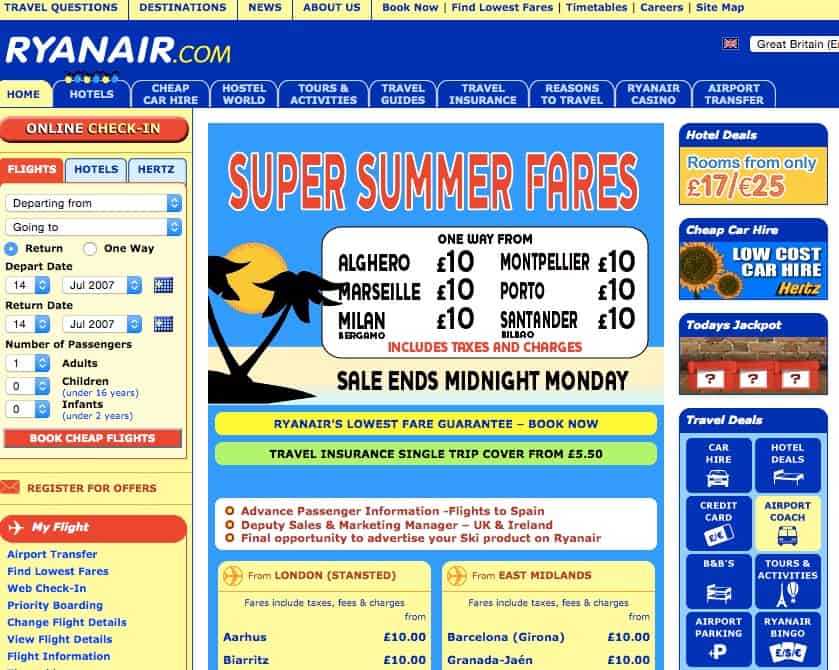
RyanAir – 2007
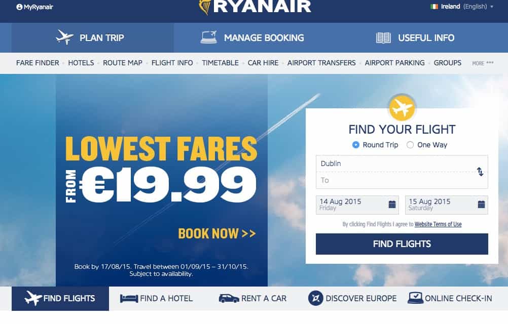
RyanAir – 2020
Gone are the days of garish colours and overwhelming navigation links, the design is clean and minimal with easy navigation and a simpler colour palette. These changes aren’t just for aesthetics either, Ryanair’s website contributed to a 25% growth in profits from 2018.
Functionality:
Originally, websites were nothing more than an online calling card for businesses. They shared little more than text-based information. However, as web use has matured over time, a company’s website has to become increasingly sophisticated to cater for their customers needs.
People are also buying online more than 15 years ago. This is why poor website performance will lead to fewer sales. To see these changes in action, let’s have a look at Vodafone.
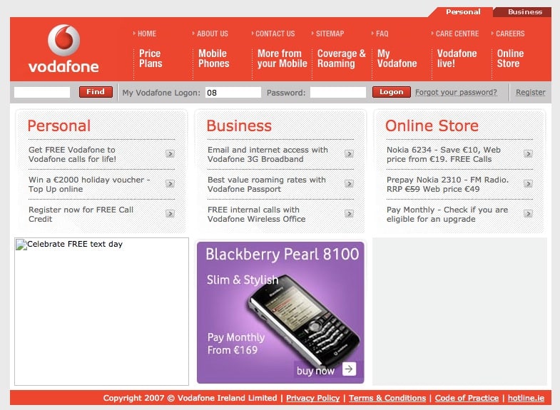
Vodafone – 2007
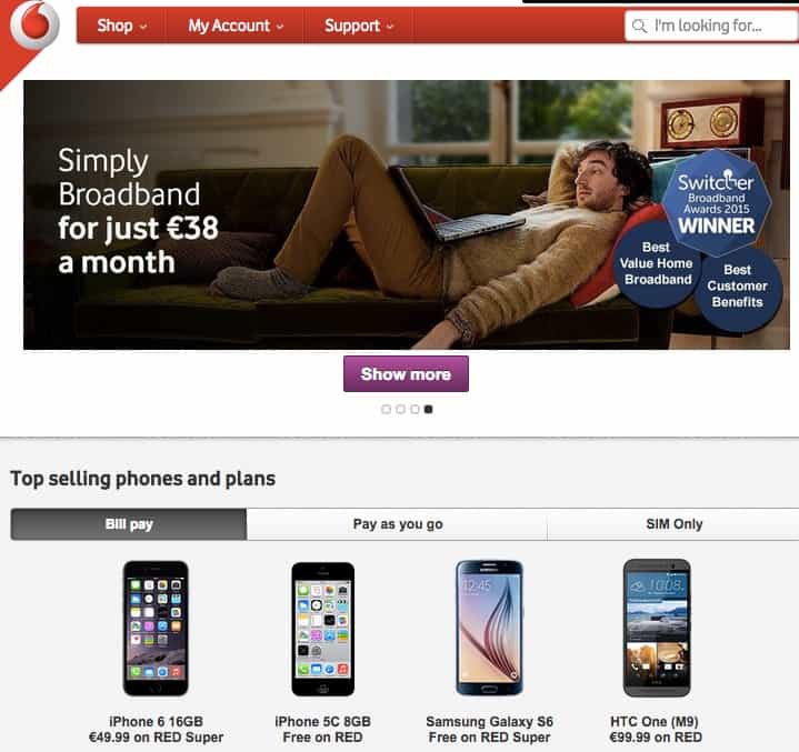
Vodafone – 2017
Back in 2007, e-commerce on their website was very limited, however fast forward to present day and you can see that e-commerce is at the core of their site, making it easier for them to make sales without having to lift a finger.
Mobile Responsive:
Before the invention of the iPhone, optimising your website for mobile was a very low priority. However, today – 51% of web traffic comes from mobile devices. If you want to be tailoring your site for the modern consumer, you need to make sure your site works on every device.
The news outlet CNN is a prime example of a site which tailors for their customers no matter what device they are using.

CNN – Mobile
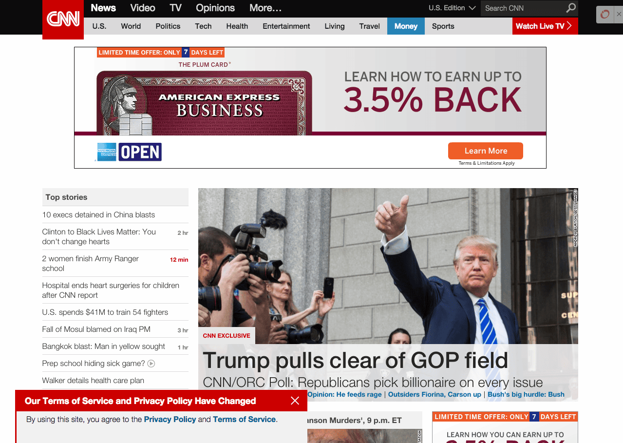
CNN – Desktop
Personalisation
Traditionally, companies have provided the same online experience to everyone, regardless of who is viewing it. However, in recent years, website personalisation has taken off. This means that a website will adapt the content presented on screen depending on who is viewing it. This could be something as simple as showing local recommendations based on location.
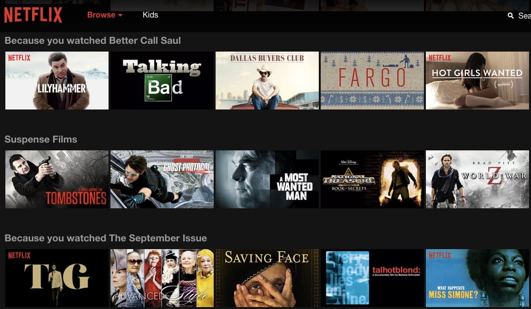
Netflix – Suggesting personalised recommendations
Netflix is a classic example of personalisation done well. They suggest titles based on previous viewing patterns, which stimulates increased usage and loyalty. However, back in 2006 – this service was in its infancy and personalisation hadn’t even been considered as a feature yet!
Is your website stuck in the past? If so, get in touch with our team of experts and we’ll be more than happy to drag you into the modern era!