Type Writer Storytelling

Storytelling on your website

By Marketing, SEO, Website

While Storytelling has been a crucial point of web design for some time, recently it has become much more evident that through animations, user interactivity or photography you can portray true personality. The idea is quite simple really, a story which is visually enticing is going to appeal much more than blocks of text ever could.

The simple truth is simplicity always wins. Regardless of how impressive your product or service is, people are less likely to be interested if it requires effort to digest the information needed to make a decision. Great imagery will make your visitors feel, often in a way that words simply cannot illustrate and in less time too. So what media’s do we have available to us to make use of visual storytelling?

1. Video

Visual communication is king, and video is a king among kings. The process of recording and displaying moving visual images. Few mediums can match the immediacy and depth of storytelling which videos can offer on your website. A professional standard video is capable of attracting visitors through sharing as well as promoting your business’ credibility.

Unfortunately hiring a creative film crew is highly expensive. As a successful video requires a lot of planning, expensive equipment and many highly trained professionals. The budget is completely necessary as a poorly conducted video is capable of hurting your brand image rather than promoting yourself. If you do have the funds available however, video is a strong choice for high ROI.

2. Parallax Scrolling

Parallax scrolling is a prominent trend which makes use of various backgrounds cycling at different speeds while you scroll giving a sense of depth. When implemented correctly parallax scrolling can be quite mesmerising, but also a great way to introduce yourself/business/product.

The issue with Parallax scrolling is that while it has the potential to be a very powerful tool for storytelling on your site, sometimes it can be distracting and hard to navigate hurting your UX. When planned thoroughly however parallax scrolling clarifies your business as simply and enjoyably as scrolling down a page.

3. Photography

Images trigger emotion. Strong authentic images will pull that emotion and bring it together with your brand. Your visitors will associates the emotions you created using imagery with your business. Use that for storytelling on your website. Imagery can say a lot about your brand, make sure that you send the right message. Ensure your images meet your brand values and connect with your audience. With these factors in mind you can easily create a cost effective website while avoiding seemingly insurmountable blocks of text.

4. Slideshare

Slideshare is mostly overlooked and underutilised, most marketers are focusing on Facebook, Twitter and LinkedIn. But are they missing out? Presentations offer a great way to provide storytelling for your business. They are fun, useful, get straight to the point and will get immediately rewarded for high quality content. Slideshare has over 60 million unique visitors a month, this might seem like a lot less than Facebook or Twitter. But there is significantly less competition than on the social media giants, meaning there is a gap in the market waiting for you.

TCmarketing Design Icon

Make the most of the infinite scroll

By Design, Website

What is Infinite Scroll?

Infinite scroll essentially deceases your page count by putting vast amounts of content into a single page. The idea is to minimise effort and distractions for the user, thus creating a better experience, but is this always the case?

Over time infinite scroll has gone from a small niche to grab people’s attention to a common trait seen in a lot of web design.

However regardless of how popular a trend may become there will always be strengths and weaknesses in their design. For social media giants like Facebook & Twitter the infinite scroll has become a natural progression, you have to consider though just because the trait has worked well for these popular sites will it work for yours?

Infinite scroll isn’t always beneficial

Successful websites will always look at the pros and cons of current trends. What’s important isn’t that you follow industry leaders, but that you are fulfilling your own site’s potential in both user experience and design. No matter how pretty your site or intriguing the content, if your UX is done poorly your visitors will plummet.

The most crucial aspect to take into consideration when looking into infinite scroll is the type of content your users will be consuming.

Most likely you will have a clear understanding of your visitors goal when they reach your website. Are you giving them the best opportunity you can to find what they are looking for? If your not sure, or maybe your site needs some slight tweaking don’t worry this article is for you. I am writing this to inform whether infinite scroll is for your website.


The Good

Low engagement websites like the social media sites mentioned are where infinite scroll is at it’s best. The reason for this is if people are stopping to look at long detailed content or watching/using a widget attached to your site, they aren’t scrolling. When scrolling through small snippets of content, but not interacting with it, that’s when infinite scrolling really shines.

Infinite scroll also caters very well to your mobile visitors market. When using a mobile phone the last thing you want is to be fiddling through pages, in fact it’s a real turn off. However when you have a site using Infinite scroll you are providing an efficient and truly responsive means to navigate masses of content and information. Users do not even have to pre-load the page as content is only accessed when you scroll down saving valuable mobile data.


The Bad

You would think that having an infinite amount of search results coming in at a fast rate could only be a good thing. However if the content requires high user engagement such as shopping, this really isn’t the case. If you are searching for a great product it can quickly seem like an impossible task when choosing from what seems like an infinite amount of choice. The truth is you’re searching for a perfect result when the most relevant result would have appeared in the first 10 items. Infinite scrolling can be used to make you feel like if you search a little more you’ll find what your looking for, but it doesn’t always work like that, leaving users frustrated.

Footers can often become impossible to use when the page has infinite scroll, just as a user may look to use a link more results are loaded and the footer bar has vanished. Links are therefore much more difficult to find and your website harder to navigate. Repeating these links elsewhere helps, but isn’t an excuse. Footers are a necessary element to your page as users will expect them and may become lost without it. Most users will not stay on a website which they cannot navigate for very long.


Bottom line

The Infinite scroll can be an incredibly versatile and useful tool in certain situations. However while the trend looks great and is very popular in 2014 that does not mean you should necessarily implement the trend yourself on your website. Think about your audience, are they searching for something very specific or is your content high engagement? Then perhaps infinite scroll isn’t for you. However if your users are looking for low engagement discovery then you could be giving your visitors a real treat.

TCmarketing SEO

Google Launches Panda 4.0 & Payday 2.0 Updates!

By SEO

SEO For Brighton BusinessHave you noticed any changes in your organic search traffic volumes recently? It could be that your site’s search engine rankings and overall Google visibility is being affected by the wave of updates that Google is presently rolling out.

Yesterday Google’s Matt Cutts announced that Panda 4.0 is currently rolling out and that webmasters & SEO Consultants may see changes in the levels of traffic driven to their sites by Google.

Panda updates in the past have typically focused on on-site issues, topical relevance and content performance value, so websites with thin, poor quality, irrelevant or diluted content have been the ones to bear the brunt of the Panda algorithm changes previously and we expect these low value content websites to be the primary targets of the latest updates.

The Payday 2.0 update focuses on some of the spammier sectors of the web where affiliates, redirects, clone sites and other black hat tactics are used to try and trick Google.

As ever, there are also strong rumours about a new Penguin update rolling out soon along with some other Google algorithm changes. Google seldom rolls out just one update at once in isolation anymore which makes it trickier for SEO Consultants to pinpoint the exact reason for changes in the ranking and traffic volumes of client’s websites – it does help us to quantify the value we add though!

It is far too early yet for us to form any conclusions of the impact of the current changes but we expect to see some impact over the next few weeks and will provide a further update along with best practice SEO recommendations as soon as we can.

Here is a good article which covers the latest updates

If you would like to keep up to date with the latest search engine algorithm changes please leave a comment below or call us on 01273 822 755

Responsive Design Workspace

16 Reasons why you need Responsive Design

By Design, Website

What is Responsive Design?

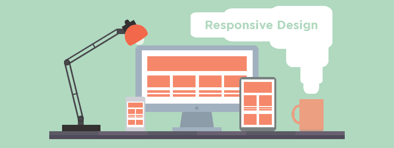
Responsive Design is when a website automatically reforms to accommodate virtually every screen size, on any device currently on the market. This might not seem like such a big deal, a few years ago it wasn’t. However the smartphone is ever growing, let alone tablets and notebooks. In this article I am writing to inform how critical it is that your website is responsive. Today, not next year, not in 6 months. Now!

Why it’s Great

1. Double tap and pinch screen no more, for your content has been optimised to be perfectly legible on any screen!

2. Menus & Buttons formatted with touch screens in mind, for a good old easy tap.

3. Creates a single website for all your online interaction.

Why it Matters

4. 66% of mobile users are frustrated with page load times.

A website which hasn’t been optimised for your mobile audience will not only alienate them on arrival, but it has the potential to drastically go overboard on data usage. That doesn’t just mean long load times, your using up more data from mobile users contracts. Double ouch.

5. In a study of 5,388 smartphone and tablet users 48% complained that mobile sites were not optimised for mobile.

When a website hasn’t been optimised for mobile use this often makes the page a lot more difficult and tedious to use. Web traffic is notoriously impatient amongst all markets, don’t give your competitors the option of one-upping you in this department.

6. According to a survey by Google 48% of users said that if a website is not optimised for mobile, it feels like the company does not care about their business.

This is a real stinger. The hard truth is in this age mobile optimisation isn’t just a neat bonus you come across occasionally, it’s expected.

7. 16% of smartphone and tablet users said “if a page loads too slowly, we give up”.

We’ve all been there, waiting for a page to load feels like a waste of time especially if there are other sites offering similar content.

8. 85% of Adults believe a mobile website is as important if not more important than their desktop counterpart.

I imagine children appreciate responsive design too.

The Rise of Mobile internet

9. Mobile users surpass desktop users before the end of 2014.

10. 97 Screen Resolutions in 2010,  232 in 2013.

11. No one screen size has more than 20% of web traffic share.

12. Mobile based searches make up one quarter of all searches.

12. 95% of Mobile users have searched for local information.

Shopping is Mobile

13. 69% of tablet users have made a purchase via their device within the last 30 days.

14. 67% of users are more likely to make a purchase on a mobile friendly site rather than a non-optimised site.

15. 60% of mobile shoppers use their smartphones while in a store, and another 50% while on their way to a store.

16. 30% of mobile shoppers abandon a transaction due to lack of mobile optimisation.

I hope that this has helped clarify Responsive design for you. If you would like to learn more about how we can help your business with web design please leave a comment below or call us on 01273 328877.


A/B Testing A vs B

A/B Testing on your website

By Marketing, Website

What is A/B Testing?

A/B testing or Split testing is the procedure intended to test the alternate versions of the elements on your web pages.

For example you may be considering to shorten the length of your sign-up form in an attempt to decrease your bounce rate and increase conversions.

When you A/B test visitors will be sent to one of two versions of the page which you are currently testing.

Effectively, A/B testing allows you to compare two versions of your page and record which version works best for your web design.

How is this beneficial?

Regularly performing the A/B test will not only improve the conversions on your website but will also keep your site from becoming stale.

Many minor changes over a long period of time will ensure that your website does not become dull to regular viewers and shows that you are a forward thinking business which is striving to give the best user experience you can.

Ultimately A/B testing is a cost effective way to raise business, you would be amazed how much of a difference something seemingly simple like changing text from bold to italics can make.

Where do I start?

One of the recurring issues amongst businesses which are looking into A/B testing is that one, they are not sure what they should change and two, what change should they make?

After all there are numerous elements to each page. To help narrow it down it’s best to give yourself an achievable aim, such as getting more people to click the link to my landing page.

By giving yourself a clear goal it not only becomes easier to monitor whether the change was a success but it’s also easier to determine what element of your site you’d like to work on.

A few examples to get you in the mood:

  •  Buttons: colour, fonts, positioning, style
  •  Images: size,  positioning, comparisons
  •  Forms: necessary questions, formatting, length
  •  Sidebars?
  •  Navigation bar: Page titles, page merging, drop down menus

Investigate your findings

Once you’ve found your aim and made the changes it’s time for the waiting game.

Promote your test as much as you can through social media or email campaigns, this will help to get significant results ASAP.  A safe bet is to wait at most 30 days before concluding the change really had a small impact, at this point it’s probably best to move on to your next test.

Remember when looking through your results that while you have a specific aim with the change that you’ve made you might have actually impacted your website somewhere else in the marketing process, do a thorough check for all differences your test might have made.

Repeat!

Congratulations, you’ve completed your A/B test.

Unfortunately this is just as much the final step as it is the starting step.

In order to ensure you are engaging with your audience continuous testing is necessary. Don’t fret though, A/B testing is proven to be one of the best decisions you can make towards a massive ROI.

Need more advice on whether A/B testing is for you? Give us a free call on 01273 328877 now.

TCmarketing SEO

Links that Can Harm the SEO of Your Brighton Business

By SEO

link building imageIn a recent discussion on Google’s Webmaster Central Forum Google’s Eric Kuan gave three examples of low quality back-links that can have a negative influence on the search engine rankings of a website. In this post we will explain why Google thinks that these links are spam. Here is Eric’s answer:

Hi,

There are still a number of inorganic backlinks pointing to your site. If you’re having trouble identifying inorganic links to your site, you might want to review this article in our Webmaster Guidelines about Link Schemes: https://support.google.com/webmasters/answer/66356.
A few examples that can help you with your clean up efforts:
{dan piano} http://www.copyrightbanque.org/2013/10/thuc-on-dich-vu-seo.html
{đàn piano điện} http://libraryofbirminghamblog.com/members/64-kunayks.html?tab=activitystream&type=all&page=3
I’d strongly suggest that you do a thorough investigation of the backlinks to your site and try to get as many inorganic links removed. Once you’ve done that, file a new reconsideration request explaining the work that you’ve done. Documentation can also help show the effort that you’ve put into to removing inorganic links to your site.


Why does Google view these links as being spam?

  • The first link on copyrightbanque.org is a keyword rich footer link with this HTML code: <a href=’http://www.musiccenter.vn/2/13/Piano-cu.html’ rel=’dofolow’>dan piano</a>. Keyword rich footer links are always viewed as being suspicious, especially if the website is not related or relevant in any way to the linked website. If the link contains a rel=’dofollow’, it becomes even more suspicious.
  • The second link on guitarpro.vn is a classic forum spam link: <a href=”http://musiccenter.vn/2/5/Dan-guitar.html” target=”_blank”>đàn Guitar</a>. Automatically created keyword rich links from forums are a major spam signal and should be avoided.
  • The link from the libraryofbirminghamblog.com website has now been removed however it looks as if this was an automatically created user profile link. There have been many spam tools in the past that automatically created user profile links from hundreds of websites.

All of these link types are bad news for your search engine rankings

How to get rid of bad backlinks that damage your rankings

Google does not like bad backlinks. Use experienced SEO Professionals like ourselves to run a Links Analysis on your website to identify any potential issues and get rid of bad backlinks that can damage the rankings of your web pages.

If you would like to find out if your website has links that have a negative influence on the rankings of your web pages call us today on 01273 328877 or leave a comment below.

Monochromatic Design

Monochromatic Design

By Design, Website

Found yourself struggling to choose what colour scheme you want to use on your website? In design the choice of colour is paramount as your audience will immediately connect and feel certain emotions upon seeing your colour scheme.

For example blue will indicate calm tones linking to maturity, professionalism and intelligence. Cultural backgrounds may change people’s initial impression but all the same everyone will immediately feel certain emotions upon seeing chosen colours.

When you mix various colours into your palette the result can be somewhat difficult to predict. So how do you go about choosing from your palette? Well, many designers will use either a colour wheel or they will use software to test different colour schemes.

However there is an alternative, monochromatic design. Monochromatic design is a website using a single primary colour with darker and lighter shades to produce a safe and unified experience for your visitors.

Advantages of Monochromatic Design

Monochromatic design is a simple solution because it is simply easier to implement. The most obvious advantage to monochromatic design is that your colours cannot clash as you are only using one. Celebrating minimalist design. In a world where colour is blatantly used to grab your attention subtle elegance suddenly becomes very noticeable. So noticeable in fact that it can be hard to forget, when you use a single colour to personify your brand for a long period of time we will associate even the colour with their produce, think about what Coca Cola & Virgin have managed to achieve with the consistent use of red.

Another benefit to monochromatic design is when used efficiently the lack of distractions will pull your visitors straight to the punch. Your audience is forced to focus on your content this is most beneficial on portfolios or product pages.

Disadvantages of Monochromatic Design

The use of one colour is an art. The lack of variation when incorrectly implemented can make a website look quite bland and empty. Another issue you may find is that monochromatic design can prove difficult to produce organic visual cues.

However you can avoid this by highlighting your focal points by applying colour which stands out against your primary colour. This will simultaneously both  grab attention quickly while remaining elegant.

I hope that this has helped clarify Monochromatic design for you. If you would like to learn more about how we can help your business with web design please leave a comment below or call us on 01273 328877.

TCmarketing Website Icon

SEO For Brighton Businesses: Penguin 3.0 is Coming, Will Your Site Survive?

By SEO, Website

Clean up your website’s backlink profile with a professional Link Detox before it’s too late

SEO Services in Brighton from Tyler ConsultantsMany SEO consultancies serving Brighton Business clients still shudder when they think back to the launch of Penguin 2.0. by Google.  Google’s Penguin 2.0 algorithm changed the rules as far as link building was concerned and as a result thousands of websites were penalized and fell rapidly down the rankings.

Website traffic dropped, as did sales revenues and for some online businesses it was the last straw. We all knew the link building algorithm changes would not stop there and we have seen many further tweaks, almost on a daily basis. However another major change is expected soon with the rollout of Penguin 3.0 this is expected top been even more severe penalising not just spammy or ‘toxic’ links but also marginal or ‘suspicious links’.   Our advice would be to ask a professional Brighton SEO firm such as ourselves to undertake a thorough analysis and ‘detox’ of the backlinks pointing to your website.

Have you done carried out a Link Risk Analysis?

An effective ongoing SEO strategy requires regular link audits of your backlink profile to find out id any new toxic or suspicious lonks have been created. Remember you cannot stop anyone creating a bad link to your website. All you can do is clean up those bad links, ie. Ask for them to be removed or proactively disavow them, just like Google recommends.

And you know what, even if some of those links are “nofollow” but look really spammy, we would go ahead and disavow them anyway. If they don’t help your organic search engine ranking there is no point in them being there so it doesn’t hurt to disavow them. And many links from previous spam blogs and articles or press release syndication sites are NOW nofollow, but might still be seen as problematic by Google. Anything that Google can categorise as an unnatural or artificial link is now a problem.

If you are not doing any Link Risk Management today, we suggest you at least contact us to run a backlink profile analysis to see what you need to do to clean up your site before the next game changing algorithm update becomes live. Please leave a comment below if you would like us to call you.

oban less is more for your website

Less is more on your website

By Design, Website, Wordpress

Your home page is really important as it’s most likely going to be the first page a visitor see’s. When you first land on a page you have certain expectations. So how do you ensure your viewers find the goodies of your site? Cut the clutter.

Sleek websites not only look great but they minimise confusion and contribute to ensuring that you achieve targets like subscribers, sales and more signups. This gives your website a spring clean that can be just what you need to up those conversions, but how do you go about it?

Simplifying your website may seem daunting at first, it’s particularly painful after having worked on that useful content. Every step you take towards streamlining your website will make an impact. You shouldn’t look at simplifying your home page as a mammoth task which you could never have the time to finish, this is an ongoing process. Improvements will be possible each and every time you search, you can take it slow as long as you don’t neglect this process. Persistence is key.

Finding the Focus of your Website

What is the necessity on your page? Most likely there will be one fundamental aspect of each page you have which you cannot go without. Perhaps it’s a Call to Action, a subscription to your newsletter, a download to your latest eBook. What ever your page’s aim is you have to narrow it down to this point as much as possible. Any distractions are only giving the visitor an excuse to leave. Don’t give them that excuse.

Minimise your page count

This doesn’t always mean deleting all your content. Merging two pages or even more into a single page can be much more user friendly than having to click through page after page. However there is almost definitely going to be at least some content which is unnecessary somewhere on your site, maybe it’s simply out of date. Then it simply has to go. When you have less places to visit on your site not only are you making content more coherent, but your navigation bar will be a lot less complicated.

Keep content above the fold

Many studies have been undertaken regarding the fold on a webpage, it is widely regarded that any content below the fold is largely ignored. Therefore it is very important that your website’s focal elements are not below the fold. While I would like to argue a gripping webpage will draw relevant users to go below the fold and that there are many irrelevant reasons which could be interfering with reading further. The evidence is there and statistically you would be much better off avoiding placing important pieces below the fold.

Non-Obtrusive Design

When reading through content the most distracting aspect of a website tends to be colour. If you want a safe bet most designers stick with the 60-30-10 Rule, suggesting that you use three colours in a ratio of 60%, 30% & 10%. Not only is this minimising interferences with your visitors but you will give a thoughtful and professional impression. You can take this one step further by understanding the demographics of your audience. Analyzing the competition will allow you to either stick to trends or stand out without alienating your audience. Highlight your focal elements with primary colours which contrast with the rest of your design so that your visitors can’t help but consider them.

Hopefully this article has informed you of the importance of simplicity. If you would like to learn more about web design and how it can help your business please leave a comment below or call us on 01273 328877

TCmarketing SEO

The Power of Social Media as a Sales Tool for Brighton Businesses

By SEO

Social Media Marketing - Tyler ConsultantsFew people would disagree that Social Media is here to stay. The actual social media networks or platforms will no doubt continue to change and evolve but people will continue to use social media both to communicate and share knowledge with their friend and families.

Social Media has also changed the way we make our buying decisions. Very few people now make any sort of product purchase without doing some research about the product on the internet.  Your customers will undoubtedly research online and compare the results of what they find to help them make an informed buying decision. Social Media sites such as forums and blogs are now used by many people to both research a product and the reputation of the seller before making the final decision of where to buy.

Many sales staff will view these changes in the buying habits of the customer as a threat, but the reality is they shouldn’t – they can provide a great opportunity and a new route to market.

Social selling” as it is known uses the latest web technologies to deliver insight and value to buyers from within their own ‘sphere of influence’.  Social Media can also let you see what customers are looking for, what their problems are and where they go to find their answers.

Here are five steps to help you win business by applying the power of social selling:

1.         Make sure you know your target market

Developing relationships with customers and prospects is a core part of the sales process for any business. The first step in using social media as a sales tool is to identify the key decision makers in your target market and work out their level of online engagement. Which social media networks do they use? How active are they on them?

2.         Research and build your knowledge

Spend time looking at the social media profiles of your target customers.  Gaining knowledge is critical when making an online connection. You need a planned strategy to listen to what your target market is talking about online. Establish what their challenges and interests are and by joining their online conversations you can become part of their sphere of influence when making their buying decisions.  You can establish yourself as a trusted supplier.

3.         Plan your content

Now you know what your target market wants, you need to share relevant, quality content with them. Create a content marketing plan that addresses the key topics and issues they are talking about. Not all the content you share needs to be your own, you can share other industry relevant content – but make sure you give credit to the source of any third party content.

4.         Become the ‘Go To’ source

When you have established yourself as a trusted source of information, and an expert in your field you can start to develop your sphere of influence. Avoid posting ‘sales driven’ content.  Your content on Social Media should be helpful, approachable and add knowledge and value to your readers.  By posting quality content you will quickly establish yourself as an authority in your subject not only with your readers but also with the search engines.

5.         Measure Progress and adjust your strategy as required

You can use various tracking technologies and software programs to review the levels of online engagement with your social media content. You will be able to see what works best, what content is most popular (page views) and critically what content created by you is being shared by your readers with their followers and friends.  By sharing your content your readers will help you to reach a wider audience to further reinforce your position as an expert in your field.

With some social media platforms such as LinkedIn you will receive regular updates which help you monitor ‘sales opportunity’ events within your online community such as job changes, comments on your posts or when people join the same groups as you.

In selling, you need to be part of your buyer’s journey from the very early stages if you want to influence their buying decision.

A well-developed social media marketing strategy that proactively helps your customers through their buying journey will increase your chance of making a sale.

If you would like to learn more about social media marketing and how it can help your business please leave a comment below or call us on 01273 328877