Category

Design

The Fold Does not Exist, Scrolling issues with Tyler Consultants

The Fold does not exist

By Design, Website, Wordpress

Introduction

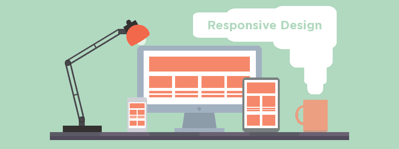
Understanding how users interact with your website is vital. Your product or service is meaningless if people cannot find an easy way to access necessary information easily.

With this in mind, it’s easy to see why people have been afraid of expecting their users to scroll down a page – it’s not always obvious to everyone that there’s more good stuff to read.

For a long time now in the web industry it has been considered arguably bad practice to expect users to scroll. The argument for this is quite simple, when people are prone to bouncing off of your website almost immediately – it’s best to catch their attention as quick as possible.

However recently UX & Research teams have been finding that “Everybody Scrolls”. This data is a testament to how important testing in the digital age is. Even a well constructed and respected theory can either change, or be proved wrong when further analysed.

Scrolling & Attention Below The Fold

Ironically, testing on the placement of content in context of the fold is by no means a new. However findings have always been remarkably inconclusive, when looked at collectively. Some research teams have found strong data backing the theory that you should try to keep content above the fold. While just as many research has provided evidence towards the notion that people are happy to scroll beyond the fold.

The issue is that research teams have not been testing extensively enough. If anything the results have shown that people sometimes scroll.

So the research should not be aimed at answering “do websites ever keep a users attention below the fold?” To recognising “which design elements provide visual cues which users need to scroll below the fold?” Huge Inc have attempted to find out the answer to this very question.

The Test

Huge conducted a test with 48 participants over 3 days – By using four different design tests:

  •  A control image, with no visual cues to scroll below the fold.
  •  A scroll arrow that cues users to scroll down.
  •  A short image, where users had to scroll to see above-the-fold content in entirety.
  •  An animated image with a moving element to lead viewers below the fold.

However what they found was that 9/10 people scrolled to the bottom of the page regardless of the visual cues (with the exception of the animated image which was 7/10.

 Suggestions

In the end scrolling is mostly linked towards the quality of the web design – First impressions count. Users will decide whether they want to find out more about your website instantly. So ensure that your web design has visual cues which integrate with your existing design and fit with your business category.

Remember, those that do scroll are showing an interest in your website and are more likely to have built a bond with your website (hence the further reading). Therefore Calls to Actions are much more effective below the fold, people are more likely to follow up on your CTA after you have provided them value.


If your finding that people are bouncing from your website before really consuming your content maybe it’s time for a website checkup. Give us a free call on 01273 328877 for any advice you may need on your site.

Pantone Colour of the Year

By Design

For the more ‘arty’ people out there, the world-renowned authority on color and provider of color systems (Pantone) has decided on the Colour of the Year 2014.

And the winner is Marsala

Colour in design is very subjective. What evokes one reaction in one person may evoke a very different reaction in someone else.  For what it is worth, this is what Marsala means to us:

  • The darker shades of red can be powerful and elegant
  • There is a hint of blood in the colour and so it can denote feelings such as passion or alarm
  • Dark red, when combined with white and gray, gives a very elegant and professional impression
  • Use shades of red to grab attention and to get people to take action.

For companies, the key is to consider how the colour you choose for your company will be perceived by your target market rather than the colour your business stakeholders like.

Wearable Technology

Why you need to prepare your website for Wearable Technology now

By Design, Website

Technology is moving ever forwards. Every now and then something truly groundbreaking occurs changing even the way people interact with each other from a day to day business. We think Wearable Technology is the advent of yet another such change. Currently with smart-watch’s there are a few neat things you can do such as making phone calls, record your health and fitness and buy a coffee without even getting up. But with nothing setting them apart from mobile devices it will be a few years before we see a real shift. Or will it?

What is Wearable Technology?

Wearable Technology is essentially aiming to be a less cumbersome smartphone with potential. How is it doing that? Currently wearable technology has only had any real success through fitness gadgets put simply, smartphones are not as easy to use while on the move. However with the arrival of Google Glass wearable technology has become more than simply not having to get a phone from your pocket. To navigate Glass’ interface you use your mind and voice. While it’s true wearing Glass does look a little strange I think it’s only a matter of time until the design is less obtrusive and the price tag is significantly dropped. Currently at a £1000 and with a very limited of optimised apps Google Glass is a very niche product. However with tech moving forward at this rate it’s only a matter of time before the design is even less obtrusive.

Why will this will affect the Web Industry?

You may have heard of the theory ‘the internet of things‘. The vast majority of industry experts suspect the internet is about to experience a massive growth through variety of use and devices. The forefront of this is wearable technology. As technology and networks like 4G develop the possibilities of everyday objects drastically increase. Hence the massive investment Google have been willing to make acquiring Nest a smart-thermostat.

As the devices we use to consume content change, the content we consume must also change. Designers will have to adapt to new trends formed to make web design accessible through the likes of Glass & iWatch.

Here are our suggestions for adapting to wearable technology:

1. Responsive Design:

While Mobile optimisation should be your concern right now. Responsive design is going to have to take yet another step forwards so that not only a variety of resolutions are compatible but also a variety of screen shapes. With android wear arriving in a variety of different shapes the advocate of these new screens is already here.

Minimalist design will help with fitting your content on such small screens plus it’s a bonus how minimalism is trendy now. Flat design highly recommended!

2. Speed is key

Android wear is about having access to information while on the move. People aren’t going to be interested in large blocks of text, or long articles. Wearable technology users want immediate, digestible information. This doesn’t just affect the content your writing, but also page-load times will become even more important than ever. For someone on the move load times will be more even more of a turn-off. Accessibility is becoming more and more important across the web and applications.

3. Coherent design

Mobile optimisation mostly includes considering usability on a smaller screen. This usually means a complete redesign on your mobile website to make it as legible as possible. While it is important to optimise your content for wearable technology, it is paramount to make your new navigation immediately recognisable.

Looking out for new trends like Google’s Material Design is becoming more crucial than ever for your website. You can expect this new emphasis on ease of use to bring out simple but powerful imagery, large text and universal language.

We need to start considering web design’s place if/when the internet of things comes to be. With so many experts convinced wearable technology will become the fastest growing technology trend we wait till it happens.These are just a few of our suggestions towards appeasing wearable technology users.

What changes to your website do you think will be necessary for wearable technology optimisation? Do you think wearable technology is just a fad? We’d love to know what your opinion so let us know in the comments below.

Don't Neglect User Experience

Don’t neglect user experience [3 Steps]

By Design, Website, Wordpress

User Experience Design

You’d be surprised how often people seem to forget who a website is for. Your website isn’t for you, it’s not for your business. Your website should be built from the ground up with one group of people in mind. Your customers. This mistake is made often by designers.

For example how often have you found a great looking website but, haven’t been able to figure out what it’s actually for? If there is ever a moment where your on a site wondering what is this company actually offering me? They’re doing it wrong.

There are a lot of great tools and design features you can use in web design. The secret to utilizing them correctly is keeping your user experience in mind.

User-oriented web design aims to provide value to the visitors. For a website to be truly useful there are a multitude of factors to consider. Is the purpose of your website immediately clear? How easy is your site to navigate? Is your content displayed appropriately? These are just a few examples of aspects which could be detrimental to your website’s UX. Thus having a significantly negative impact on your website.

User Experience Design is all about seeing your website through a visitors perspective. What is a visitor to our website going to be looking for? How can we illustrate simply what we are offering? To achieve user satisfaction, these are the kinds of questions you ought to ask when planning your website.

1. Navigation

Navigation is a really key element to the user experience. Empowering the user through navigational aids allows them to find what they are looking for quickly and without confusion. There are numerous ways to assist a user in their browse through your website. Making good use of these measures will inspire confidence in the user and decrease bounce rates.

For a user to navigate your site access points need to be clear. The standard response to this is a navigation bar. Navigation bars are always present, giving users options at all times. Whereas a “hamburger icon” covered in a previous blog requires being clicked on to give access to a sidebar. This not only requires two actions from the user to access the page they require. This also means that the user cannot see what information is available without actively looking for it.

Tool’s website ‘A Production Company‘ gives a fantastic demonstration of diverse navigation tools. The navigation bar alone screams we want a great user experience. Not only have they created a slick and precise navigation bar but it is actually fun to use. By utilising a neat animation on hover the bar creates a good sense of feedback. This level of user centred design can be seen throughout the website. The result is a very appealing user experience. Users are fully engaged to the site as well being visually pleased.

2. Optimisation

If there’s one thing which really puts me off a website even if I am interested in it’s content, it’s load times. People aren’t patient enough to wait more than a few seconds when there are so many alternatives easily available.

In the end this mainly comes down to planning your user experience early. While you may have come up with a new groundbreaking web design. There are a few things to consider before implementing them. How demanding is this website going to be on people’s websites? Do all of these functions translate onto mobile devices? Is your website responsive? (check out our blog on responsive design)

Unfortunately not everyone has broadband yet or fast computers. This is particularly true with the recent exposure of tablets and mobile phones.

3. Accessibility

Accessibility is ensuring all users can access the information regardless of disability and ability etc. Great examples of accessibility best practises are say ensuring images have title tags for screen readers for the blind. Or your site background and font color is set at a suitable contrast for partially sited or color blind people. Video transcripts for deaf people are also worth considering.

If you would like any help enhancing the user experience for your website, don’t hesitate to give us a call on 01273 328877 for your free consultation.

Google's Material Design

Material Design, Google’s new UI

By Design

Google has always been a little behind in design for mobile Operating Systems. Since the iPhone, Apple has been clearly has pushed for visual appeal. While Android has aimed for functionality both have found success in these fields. But has Google gotten a little too behind? The relative desirability of Apple phones seems to suggest so. Even Microsoft have had success with flat design. However with Android L Google looks like they are finally recognising the importance of an attractive, responsive interface. Having finally introduced a vast overhaul with Material Design to huge acclaim.

So how has material design made such an impact? Android L has removed unnecessary design elements making a new truly responsive design. The result is both stunning and practical, all whilst having a very unique look. So how did they do it? Duarte (Android’s VP of design) says that Google are finally looking at the bigger picture. Before Google’s several design teams were very disjointed. Teams would work on a single resolution solving their own issues, unaware of the repercussions. Effectively, creating a very inconsistent design across various devices. Now, the design teams are unified working together with a single aim. To create a simple, functional UI which is just as fantastic to behold as it is to use.

Material Design Guidelines

Google have made their new design’s intentions public. Their aim is to incorporate both classic design principles while using new technologies to innovate. To Develop a unified experience which is powerful across all devices regardless of input method or resolution.

Their basis of material design’s principles has been heavily inspired from print-based design. Google says “The material is grounded in tactile reality, inspired by the study of paper and ink, yet technologically advanced and open to imagination and magic”.

Universal Language

By using layers and lighting material design creates a sense of depth. Google says that this is intentional, not only does it look pretty these elements anchor hierarchy, meaning and focus universally. This can be enforced further through the use of colour and typography if needed.

However Google have gone one step further with Material design. Not only are they looking to physical world rules to create understanding of functionality. Android L looks to visualise actions made through motion. Motion provides subtle but clear feedback when a user initiates action. Even if for the purpose of an application a design completely changes, material design will use motion to keep continuity fluid. Read in full here.

Industry Impact

We think this redesign is a huge step in the right direction and expect to see it have a massive impact in the industry. Much like Microsoft have done with flat design. Google are clearly aiming for this with their incredibly detailed guidelines and web development kit (they are practically telling you how to replicate their design).

Give us as call on 01273 328877 for your free website consultation.

Hamburger Icon

Should your website use the Hamburger icon?

By Design, Website, Wordpress

What is the Hamburger icon?

The Hamburger icon is a website tool. Intended to make minimalistic design optimal for mobile. Three simple horizontal bars make up the hamburger icon. The icon is often placed in a top corner as an alternative to a navigation bar. How does it work? The icon represents a hidden navigation tool (like a side menu).

The idea is that when you have a navigation bar, while fine on a regular site it can take up too much space on mobile. This is a real problem. The hamburger icon is an attempt at keeping a minimalist design while still being functional.

However the hamburger icon has received a lot of criticism. Despite the clear need for less cluttered mobile sites. Here’s why:

Hamburger icon cons

The hamburger icon is often considered a poor design choice. This is because you are effectively hiding all of your website’s feature behind an icon. There is a lot of theory suggesting that the hamburger icon is bad for user engagement. Put simply if users can’t see your navigation menu, they won’t use it.

The argument is that people are not familiar enough with the hamburger icon to recognise that it is used to hide your website or apps special features. Hamburger buttons are not very efficient in terms of UX. Think about it. In comparison to a navigation bar you have to tap just to even see what your options are. Then again if you want to move to your next page. Websites visitors are not known for their patience. Do not give them a reason to bounce from your site before they even know what your offering.

Also the triple bar is not particularly indicative of anything it is quite literally three lines. This unintuitive design is very negative on all kinds of conversions.

Hamburger icon pros

So, does this mean there is no place for the Hamburger icon? Actually no. In fact in terms of mobile optimisation the icon can prove vital. Yes, you are risking visitors misunderstanding the purpose of your hamburger. But the triple bar is becoming more and more prevalent across all devices. While I think there is very few circumstances to warrant a hamburger icon on your desktop website, navigation bars on mobile’s are incredibly frustrating.

Not to mention the lack of screen space. There are some alternatives to the hamburger even on mobile however such as the Tab Bar. An array of small navigation bars spread out across your page. This is definitely worth considering especially if you have less navigation options on your website.

Conclusion

In the end the Hamburger icon has a clear purpose. To give smaller resolutions some space to breathe. While it’s true that it is not the easiest icon to recognise initially. Once you understand it’s function it quite clearly indicating some kind of list. When you consider the only realistic alternative so far is the word ‘menu’, I think the icon is here to stay.

With time people will only grow more accustomed to the icon but for now it is definitely worth considering whether you really need this on your website, mobile or not.


I hope that this has helped clarify the Hamburger icon issue for you. If you would like to learn more about how we can help your business with web design please leave a comment below or call us on 01273 328877.

TCmarketing Design Icon

Make the most of the infinite scroll

By Design, Website

What is Infinite Scroll?

Infinite scroll essentially deceases your page count by putting vast amounts of content into a single page. The idea is to minimise effort and distractions for the user, thus creating a better experience, but is this always the case?

Over time infinite scroll has gone from a small niche to grab people’s attention to a common trait seen in a lot of web design.

However regardless of how popular a trend may become there will always be strengths and weaknesses in their design. For social media giants like Facebook & Twitter the infinite scroll has become a natural progression, you have to consider though just because the trait has worked well for these popular sites will it work for yours?

Infinite scroll isn’t always beneficial

Successful websites will always look at the pros and cons of current trends. What’s important isn’t that you follow industry leaders, but that you are fulfilling your own site’s potential in both user experience and design. No matter how pretty your site or intriguing the content, if your UX is done poorly your visitors will plummet.

The most crucial aspect to take into consideration when looking into infinite scroll is the type of content your users will be consuming.

Most likely you will have a clear understanding of your visitors goal when they reach your website. Are you giving them the best opportunity you can to find what they are looking for? If your not sure, or maybe your site needs some slight tweaking don’t worry this article is for you. I am writing this to inform whether infinite scroll is for your website.


The Good

Low engagement websites like the social media sites mentioned are where infinite scroll is at it’s best. The reason for this is if people are stopping to look at long detailed content or watching/using a widget attached to your site, they aren’t scrolling. When scrolling through small snippets of content, but not interacting with it, that’s when infinite scrolling really shines.

Infinite scroll also caters very well to your mobile visitors market. When using a mobile phone the last thing you want is to be fiddling through pages, in fact it’s a real turn off. However when you have a site using Infinite scroll you are providing an efficient and truly responsive means to navigate masses of content and information. Users do not even have to pre-load the page as content is only accessed when you scroll down saving valuable mobile data.


The Bad

You would think that having an infinite amount of search results coming in at a fast rate could only be a good thing. However if the content requires high user engagement such as shopping, this really isn’t the case. If you are searching for a great product it can quickly seem like an impossible task when choosing from what seems like an infinite amount of choice. The truth is you’re searching for a perfect result when the most relevant result would have appeared in the first 10 items. Infinite scrolling can be used to make you feel like if you search a little more you’ll find what your looking for, but it doesn’t always work like that, leaving users frustrated.

Footers can often become impossible to use when the page has infinite scroll, just as a user may look to use a link more results are loaded and the footer bar has vanished. Links are therefore much more difficult to find and your website harder to navigate. Repeating these links elsewhere helps, but isn’t an excuse. Footers are a necessary element to your page as users will expect them and may become lost without it. Most users will not stay on a website which they cannot navigate for very long.


Bottom line

The Infinite scroll can be an incredibly versatile and useful tool in certain situations. However while the trend looks great and is very popular in 2014 that does not mean you should necessarily implement the trend yourself on your website. Think about your audience, are they searching for something very specific or is your content high engagement? Then perhaps infinite scroll isn’t for you. However if your users are looking for low engagement discovery then you could be giving your visitors a real treat.

Responsive Design Workspace

16 Reasons why you need Responsive Design

By Design, Website

What is Responsive Design?

Responsive Design is when a website automatically reforms to accommodate virtually every screen size, on any device currently on the market. This might not seem like such a big deal, a few years ago it wasn’t. However the smartphone is ever growing, let alone tablets and notebooks. In this article I am writing to inform how critical it is that your website is responsive. Today, not next year, not in 6 months. Now!

Why it’s Great

1. Double tap and pinch screen no more, for your content has been optimised to be perfectly legible on any screen!

2. Menus & Buttons formatted with touch screens in mind, for a good old easy tap.

3. Creates a single website for all your online interaction.

Why it Matters

4. 66% of mobile users are frustrated with page load times.

A website which hasn’t been optimised for your mobile audience will not only alienate them on arrival, but it has the potential to drastically go overboard on data usage. That doesn’t just mean long load times, your using up more data from mobile users contracts. Double ouch.

5. In a study of 5,388 smartphone and tablet users 48% complained that mobile sites were not optimised for mobile.

When a website hasn’t been optimised for mobile use this often makes the page a lot more difficult and tedious to use. Web traffic is notoriously impatient amongst all markets, don’t give your competitors the option of one-upping you in this department.

6. According to a survey by Google 48% of users said that if a website is not optimised for mobile, it feels like the company does not care about their business.

This is a real stinger. The hard truth is in this age mobile optimisation isn’t just a neat bonus you come across occasionally, it’s expected.

7. 16% of smartphone and tablet users said “if a page loads too slowly, we give up”.

We’ve all been there, waiting for a page to load feels like a waste of time especially if there are other sites offering similar content.

8. 85% of Adults believe a mobile website is as important if not more important than their desktop counterpart.

I imagine children appreciate responsive design too.

The Rise of Mobile internet

9. Mobile users surpass desktop users before the end of 2014.

10. 97 Screen Resolutions in 2010,  232 in 2013.

11. No one screen size has more than 20% of web traffic share.

12. Mobile based searches make up one quarter of all searches.

12. 95% of Mobile users have searched for local information.

Shopping is Mobile

13. 69% of tablet users have made a purchase via their device within the last 30 days.

14. 67% of users are more likely to make a purchase on a mobile friendly site rather than a non-optimised site.

15. 60% of mobile shoppers use their smartphones while in a store, and another 50% while on their way to a store.

16. 30% of mobile shoppers abandon a transaction due to lack of mobile optimisation.

I hope that this has helped clarify Responsive design for you. If you would like to learn more about how we can help your business with web design please leave a comment below or call us on 01273 328877.


Monochromatic Design

Monochromatic Design

By Design, Website

Found yourself struggling to choose what colour scheme you want to use on your website? In design the choice of colour is paramount as your audience will immediately connect and feel certain emotions upon seeing your colour scheme.

For example blue will indicate calm tones linking to maturity, professionalism and intelligence. Cultural backgrounds may change people’s initial impression but all the same everyone will immediately feel certain emotions upon seeing chosen colours.

When you mix various colours into your palette the result can be somewhat difficult to predict. So how do you go about choosing from your palette? Well, many designers will use either a colour wheel or they will use software to test different colour schemes.

However there is an alternative, monochromatic design. Monochromatic design is a website using a single primary colour with darker and lighter shades to produce a safe and unified experience for your visitors.

Advantages of Monochromatic Design

Monochromatic design is a simple solution because it is simply easier to implement. The most obvious advantage to monochromatic design is that your colours cannot clash as you are only using one. Celebrating minimalist design. In a world where colour is blatantly used to grab your attention subtle elegance suddenly becomes very noticeable. So noticeable in fact that it can be hard to forget, when you use a single colour to personify your brand for a long period of time we will associate even the colour with their produce, think about what Coca Cola & Virgin have managed to achieve with the consistent use of red.

Another benefit to monochromatic design is when used efficiently the lack of distractions will pull your visitors straight to the punch. Your audience is forced to focus on your content this is most beneficial on portfolios or product pages.

Disadvantages of Monochromatic Design

The use of one colour is an art. The lack of variation when incorrectly implemented can make a website look quite bland and empty. Another issue you may find is that monochromatic design can prove difficult to produce organic visual cues.

However you can avoid this by highlighting your focal points by applying colour which stands out against your primary colour. This will simultaneously both  grab attention quickly while remaining elegant.

I hope that this has helped clarify Monochromatic design for you. If you would like to learn more about how we can help your business with web design please leave a comment below or call us on 01273 328877.

oban less is more for your website

Less is more on your website

By Design, Website, Wordpress

Your home page is really important as it’s most likely going to be the first page a visitor see’s. When you first land on a page you have certain expectations. So how do you ensure your viewers find the goodies of your site? Cut the clutter.

Sleek websites not only look great but they minimise confusion and contribute to ensuring that you achieve targets like subscribers, sales and more signups. This gives your website a spring clean that can be just what you need to up those conversions, but how do you go about it?

Simplifying your website may seem daunting at first, it’s particularly painful after having worked on that useful content. Every step you take towards streamlining your website will make an impact. You shouldn’t look at simplifying your home page as a mammoth task which you could never have the time to finish, this is an ongoing process. Improvements will be possible each and every time you search, you can take it slow as long as you don’t neglect this process. Persistence is key.

Finding the Focus of your Website

What is the necessity on your page? Most likely there will be one fundamental aspect of each page you have which you cannot go without. Perhaps it’s a Call to Action, a subscription to your newsletter, a download to your latest eBook. What ever your page’s aim is you have to narrow it down to this point as much as possible. Any distractions are only giving the visitor an excuse to leave. Don’t give them that excuse.

Minimise your page count

This doesn’t always mean deleting all your content. Merging two pages or even more into a single page can be much more user friendly than having to click through page after page. However there is almost definitely going to be at least some content which is unnecessary somewhere on your site, maybe it’s simply out of date. Then it simply has to go. When you have less places to visit on your site not only are you making content more coherent, but your navigation bar will be a lot less complicated.

Keep content above the fold

Many studies have been undertaken regarding the fold on a webpage, it is widely regarded that any content below the fold is largely ignored. Therefore it is very important that your website’s focal elements are not below the fold. While I would like to argue a gripping webpage will draw relevant users to go below the fold and that there are many irrelevant reasons which could be interfering with reading further. The evidence is there and statistically you would be much better off avoiding placing important pieces below the fold.

Non-Obtrusive Design

When reading through content the most distracting aspect of a website tends to be colour. If you want a safe bet most designers stick with the 60-30-10 Rule, suggesting that you use three colours in a ratio of 60%, 30% & 10%. Not only is this minimising interferences with your visitors but you will give a thoughtful and professional impression. You can take this one step further by understanding the demographics of your audience. Analyzing the competition will allow you to either stick to trends or stand out without alienating your audience. Highlight your focal elements with primary colours which contrast with the rest of your design so that your visitors can’t help but consider them.

Hopefully this article has informed you of the importance of simplicity. If you would like to learn more about web design and how it can help your business please leave a comment below or call us on 01273 328877