Category

web design

One Page Websites – Web Trend 2015

By Design, web design, Website

Websites are becoming more simple as we go into late 2015. They are becoming less but more. Once, you needed a page for everything but now it seems you only need 1.

A lot of sites today put all their content on the landing page and have it scroll to reveal it all. Its also common with this approach to make the site more interactive and feature more animations and movement as there is not much else for you to click on. This technique can be very effective and can work great for curtain companies and fields.

When appropriate, we really like this style and below are some examples of websites using the style to the best of it’s abilities.

Storytelling – Web Trend 2015

By Design, web design, Website

A website is a great tool for reaching a wider audience and drawing people in for a product, a place, or a person. There are many ways to keep people interested once they land on your website, but if we have learned anything from books it’s that a good story can keep us hooked for hours.

In 2015 great stories have crept in to the world of websites and now it’s a great way to keep people on your page whether it’s a visual story, a written one, or a combination of the two. Most designers utilize the scroll feature to tell the story; leading you through the site. The story is rarely pointless as usually it gets to the point in the end and tries to sell you something or advertise someone’s abilities or work but what else are websites for?

When appropriate, we really like this style and below are some examples of websites using the style to the best of it’s abilities.

Three Dimensional Space – Web Trend 2015

By web design, Website

Flat website designs are not a thing of the past yet, but we are seeing the 3D designs take over…

A 3D design adds so much depth to a site. It makes it more of an adventure, rather than the basic scroll up/scroll down. The more fun and interesting the design is, the more you are going to remember it and that’s why the 3D designs are starting to dominate.

It’s not very often that a business focused company like a bank or an insurance company would use this style, it’s more for websites trying to send a message or make their site more interactive. There is nothing worse than a static webpage that doesn’t stand out and does nothing to engage the viewer.

When appropriate, we really like this style and below are some examples of websites using the style to the best of it’s abilities.

Media Masonry – Web Trend 2015

By web design

If its not one large image or video its lots of smaller ones stuck together. However, that doesn’t mean it looks bad.

Media grids and masonry are popular on portfolio and gallery sites and it works well. It’s a great way to show a lot of images or videos from one window of space. Each image/video complete with its own hover animation and link. The way the images/videos are laid out can be different depending on the style of the business. It doesn’t have to be just 2D rectangular media, they can be paralaxed, opaque, roll-overs, animated, or 3D.

When appropriate, we really like this technique and below are some examples of using the style to the best of it’s abilities. We have also used this technique in some of our websites.

Innovative Navigation – Web Trend 2015

By web design

Websites are changing the way you navigate them, making it easier and much more interesting to scroll your way through the site.

All scrolling used to be was vertical but now there are better ways to work your way up and down, left and right, or in and out. Not only are there new ways to navigate, but it can be much more visually pleasing with animations and pop-ups that are activated by scrolling.

Parallax effects are becoming increasingly popular with designers. It makes the content jump of the page and makes the page look deeper and more three-dimensional.

When appropriate, we really like this technique and below are some examples of using the style to the best of it’s abilities. We have also used this technique in some of our websites.

Bigger Is Better – Web Trend 2015

By web design

Bigger Is Better

Websites are getting bigger and better every year. For designers, a larger more expansive canvas allows for some innovative designs that push the boundaries of how a website can draw people in and introduce them to something exciting.

A lot of websites today are going all out, mainly with their front pages. They most often consist of a large image or video with only a title or a few words over the top that covers the whole page above the fold.  That along with a hidden or sometimes non-existing main menu makes a simple yet eyecatching design. The reason for this trend is mostly visual. With this design you are able to hit you’re users with a wow factor as soon as they enter the site. Its also easy to code and works well on other media platforms like smartphones and tablets.

It does not have to be just the home page, large open designs are becoming increasingly popular. Spaced out text with large background images. when it comes down to it you dont necessarily want people to be drawn to the text. By keeping small amounts of text spaced out the site is not overwhelming the user with information and keeps their experence on the site relaxing and memorable.

When appropriate, we really like this technique and below are some examples of using the style to the best of it’s abilities. We have also used this technique in some of our websites.

www.tgfml.com

www.tgfml.com

weaintplastic.com

weaintplastic.com

www.qedstructures.co.uk

www.qedstructures.co.uk

apps.ua

apps.ua

web design in Brighton by Tyler Consutants

Choosing The Right Web Design Company in Brighton

By web design

Founded in 1998, we are a full-service marketing company and design agency with a focus to help companies get the most from their marketing potential. We also specialise in web design in Brighton, UK. Over the years we have produced a solid reputation for building and designing websites that look modern and are exceptionally easy to use. With this experience and knowledge we know exactly what aspects and factors you need to consider when it comes to choosing the right web design company for your business.

As a business owner you will no doubt already know that in order to succeed within an incredibly strong competitive market you will need to be able to offer the best brand experience for all of your loyal and potential customers. During the past decade the way companies market their brand has changed significantly as a result of social media platforms and mobile devices such as smartphones and tablets.

These new methods of browsing and buying have allowed consumers increased power to choose the brand they wish to commit too. This new type of consumer can often leave business owners with the fundamental task of finding the right and best website design company to deliver their company’s message to their targeted audience and potential customers in the most effective and efficient way possible.

Across the UK there are hundreds of web design companies popping up here, there, and everywhere, which means there are plenty to choose from, but how can you decide which one is right for you? Without a strong and user friendly web design, you are unfortunately placing both your company and brand at a disadvantage if you are trying to grow your company’s brand online.

There is an abundance of professional website design companies in Brighton, London, Edinburgh and all other major cities, but many don’t understand that a clean and effective website is well designed website that can help you grow your business and brand with ease.

So before you start to work your way through the mountain of web design companies out there, it is important to understand what basic things you should always expect and what they should be doing for you.

  • Design your website’s physical design such as layout, colours, etc.
  • Setup your websites CMS.
  • Place any static web pages that you may need.
  • Setup a control panel or publishing page where you can add new content/products
  • Provide you with any logins and passwords to the CMS so you can edit the website.
  • Inform you of how to use the CMS if you don’t understand.

Now that you understand a little more about what to expect from your web design company, it time to think about where they are based. If your company is situated in Brighton, a web design company in Brighton is preferred, as they are close and meetings can be arranged quickly and easily.

Below you will find five quick tips on how to choose the right web design company for your business and brand.

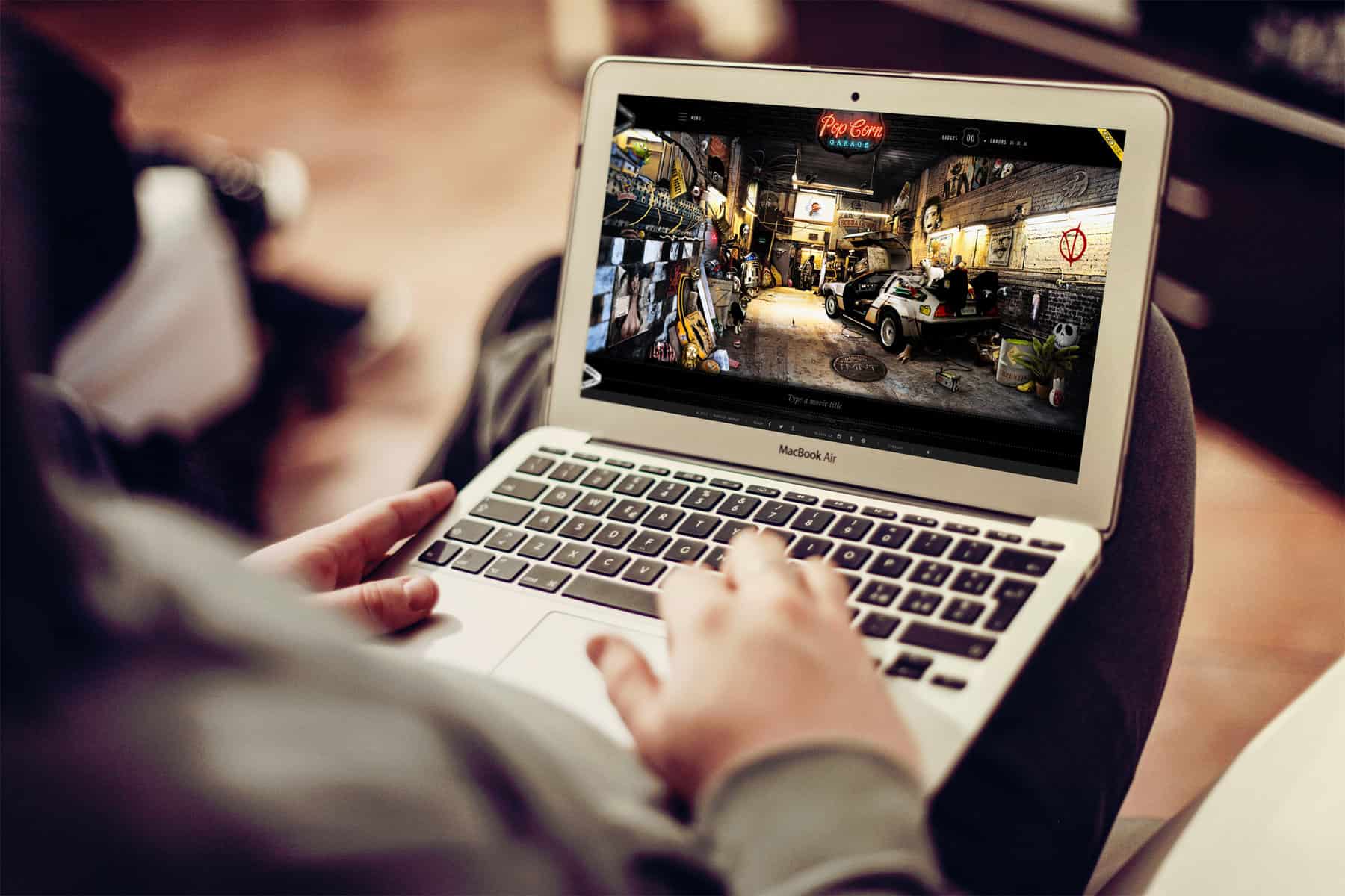
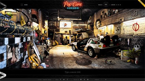
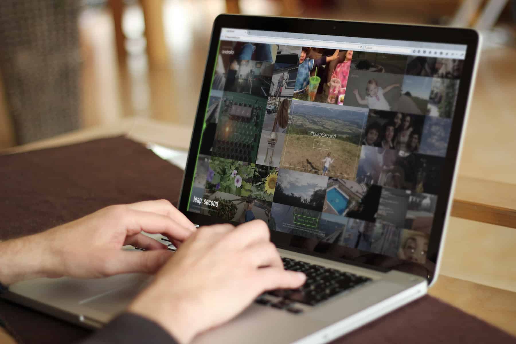
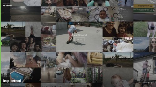
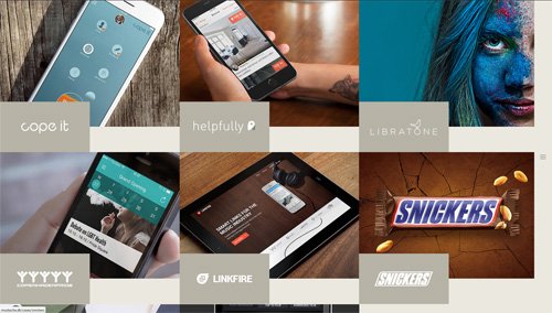
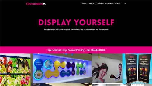
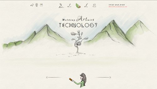
  1. Take a look at a company’s web design portfolio.

As like many artists, web designers all come with their own bespoke design style. This means you will more than likely find a designer who creates websites with the exact look that you want for your company branding. If you have found a designer or a company, make sure that you browse through the samples of websites on their portfolio.

  1. Communicate with the web design company, tell them what it is that you need.

As with any good service, you expect them to be honest. A good designer should be entirely honest with you and tell you exactly how capable they are at achieving what you are looking for. The true sign of a good designer is that they will talk about your company, your services and products to gain a real insight on what angles to take when designing your website.

  1. Don’t choose a web design company that promises to put your website on the first page of Google.

Placing your website on the front page and the first rank of Google is not your website designers job. Their job is to design and to provide you with the necessary tools so that your website has the potential to get to the front page of Google and other search engines. Any designer or company who promises the first page of Google in their sales package should be avoided.

  1. Don’t choose a web design company who will charge you to make updates.

Every website on the world wide web is continually in progress. When a website is ‘finished’ it never truly is, as new products and content should be added on a regular basis. This means, if you are a company that needs to update their website with new content and products each week or month, you do not want to be spending a fortune updating it.

  1. Don’t choose a web design company who designs websites all in Flash.

Many of us are aware that Google can search Flash websites, but they often come across tacky and dated. It increases website load time significantly (which may hurt your ranking), they don’t work on all browsers, they certainly do not work on some mobile devices and flash websites are not always user friendly.

If you would like to know more about our web design services in Brighton please leave a comment below or call us on 01273 328877

web design in Brighton by Tyler Consutants

Web Design in Brighton

By responsive design, web design

Are you a Brighton based business owner or company marketing director wondering how successful your current web design is? Excluding social media, do you actually have a local web presence at all? Whether you’re a Brighton estate agency, a local artist or fitness coach you still need to be reachable online through more ways than ever before. Take a look at the most accomplished Brighton based organisations online and a quick search will reveal they all have one thing in common – a solid web design.

Web design in Brighton has evolved quickly over just the last few years due mostly to the explosion in smartphones and tablets, with mobile usage now beginning to overtake traditional desktop use in Brighton. Therefore it is crucial that your website or blog can be accessed easily on multiple sized screens at any moment. This can be achieved using the latest responsive web design technology. This is vital not just for your customers, but also important for Search Engine Optimisation (SEO) with Google recently confirming it was now ranking website results based on how mobile friendly their presence was. For example, a Brighton Florist with a responsive web design will now likely rank above their local competitor, naturally enjoying more visitors. Can you afford to miss out on this latest local trend?

At Tyler Consultants we understand better than anyone how to engage with the local Brighton online community. You only have a few seconds to grab the attention of your online audience so your website design needs to load quickly, be easy to navigate and be usable on all modern devices. Our bespoke web designs specialise in online call to actions too, encouraging Brighton visitors to engage in your website either by placing an order or contacting you for a quote.

If you are based in Brighton, Hove or surrounding areas and would like a free chat about your current web design solution then give us a quick call today on 01273 328877, or, if preferred, leave a comment below.

How to Increase Your Web Conversions by 102% with One Simple Tweak

By Marketing, web design

Are your website conversions stagnating?

Find yourself checking your web traffic only to see that bounce rate still high as ever?

Even those who don’t bounce from your site immediately rarely end up actually getting in contact, let alone become a lead.

You know there must be something you can do make your landing page more enticing, but what?

There’s all kinds of advice out there but ultimately, it’s all pretty vague and often even contradicts itself.

Truth is there is only one sure fire design trend which will completely blow up your conversion rate.

This is a tale about how Highrise (subsidiary of Basecamp) went and turned their conversion rate right around!

Highrise were faltering in their conversions, with very few sign ups to their landing page. But after many A/B tests they discovered one particular technique completely outshone all others when it came to converting visitors. And you can bet that Highrise are not the only company reaping in the rewards of this rather simple technique.

So what exactly is this highly coveted super secret sauce of supreme subscriptions? Well, as mentioned earlier it’s a rather simple one. In fact you might even go to say it was obvious. The best way to increase your sign-up increase is through big quality images.

BIG IMAGES MEANS BIG PRIZES

I’m sure you’ve all seen websites these days which sport huge quality pictures. It’s not exactly a secret that they are capable of an immediate visual impact.

But that’s not why “hero images” are so prominent on big branded websites like Microsoft, Apple & Amazon. These brands will have had incredibly thorough and detailed tests on their websites and the results are all heading towards this trend.

Apple are known for masterful imagery on their website, with their already desirable products it’s no wonder that they are doing so well right now.

However, until relatively recently big images like these were seldom seen. This is because these images will slow down the load time of your website. That said, it seems like the pros have finally outweighed the cons and our internet speeds are able to put up with these weighty file sizes.


The beauty of hero images is that they aren’t just beautiful, they are practical too. Giving visitors the ability to examine every detail of your image leads to a much more engaged and confident sign up.

Not only are people more likely to convert they are less likely to regret doing so. Allowing visitors to see exactly what they are signing up to will always improve your results, so it makes sense that powerful images convert.

Adobe Comp CC Formats

Adobe Anywhere

By Design, Recommended, web design

Adobe Release New Mobile App, Comp CC

On March 30th Adobe released the latest product in their suite of software, Adobe Comp CC. By creating a connection between your mobile and desktop applications with Creative Cloud, Adobe have been able to fill a need which has long been in the undertaking but never quite fulfilled. Capturing those moments of inspiration and ingenuity while away from your desk.

While for some time now we have had access to a multitude of productivity apps, none have been quite like this.  Comp is designed to allow designers to capture their thoughts and concepts into the Adobe’s system wherever you are. Not just as a note, but as a professional standard wireframe or layout – which can then be imported by the appropriate Adobe tool e.g. Illustrator.

A website layout designed in Adobe Comp CC

How does it work?

The beauty of this system is in how easily and naturally the app works. Adobe have recognised that a full suite of features is simply not going to work on a tablet or mobile device.

So creating print, mobile and web design layouts while on the move requires a completely new approach. Adobe have tackled this with appropriate techniques for the device, namely you’ll be using gestures to create and edit your elements. Here are a few examples:

  • To create a circle you’ll only need to attempt drawing one by hand and Comp will automatically correct it into a perfect circle for you.
  • To create a headline you only need to draw a rectangle and tap a dot beside it. Text is even simpler! Just draw lines followed by a dot to find your lorem ipsum perfectly in place.
  • Images can be added by drawing an X shape where you would like the image.

As you can see, while the platform is limited in what you can create, you can build it fast even using the unrefined touch-screen input. Another really handy feature of Comp is being able to connect to various locations for your image or typography files.

Here are a few examples of Adobe Comp in action:

Some Example Images of Adobe Comp

While I imagine these examples have been spruced up by desktop editors in combination with Comp, I still think that the concept is really strong and something I would seriously consider investing in. It’s worth noting that Adobe Comp CC is only available on iPad, so android tablet users unfortunately lose out here.

While in the past few months it’s looked like Adobe might be shaken by some competition mainly with Affinity this is a sure sign that Adobe aren’t going to sit and wait for everyone else to catch up and will continue to innovate.